Plots warming stripes with ggplot2. These graphics represent temperature change at a location over at least 70 years. Each stripe shows the annual average temperature at that station.
Arguments
- data
A data frame with date (
year) and temperature (temp) variables.- plot_type
A character string specifying the plot type:
"background","stripes","trend"or"animation".- plot_title
A character string for the plot title.
- n_temp
The number of colors in the palette. Defaults to
11.- col_pal
A character string specifying an
hcl.pals()color palette.- ...
Further arguments passed to
ggplot2::theme().
Value
A ggplot2::ggplot() object.
Note
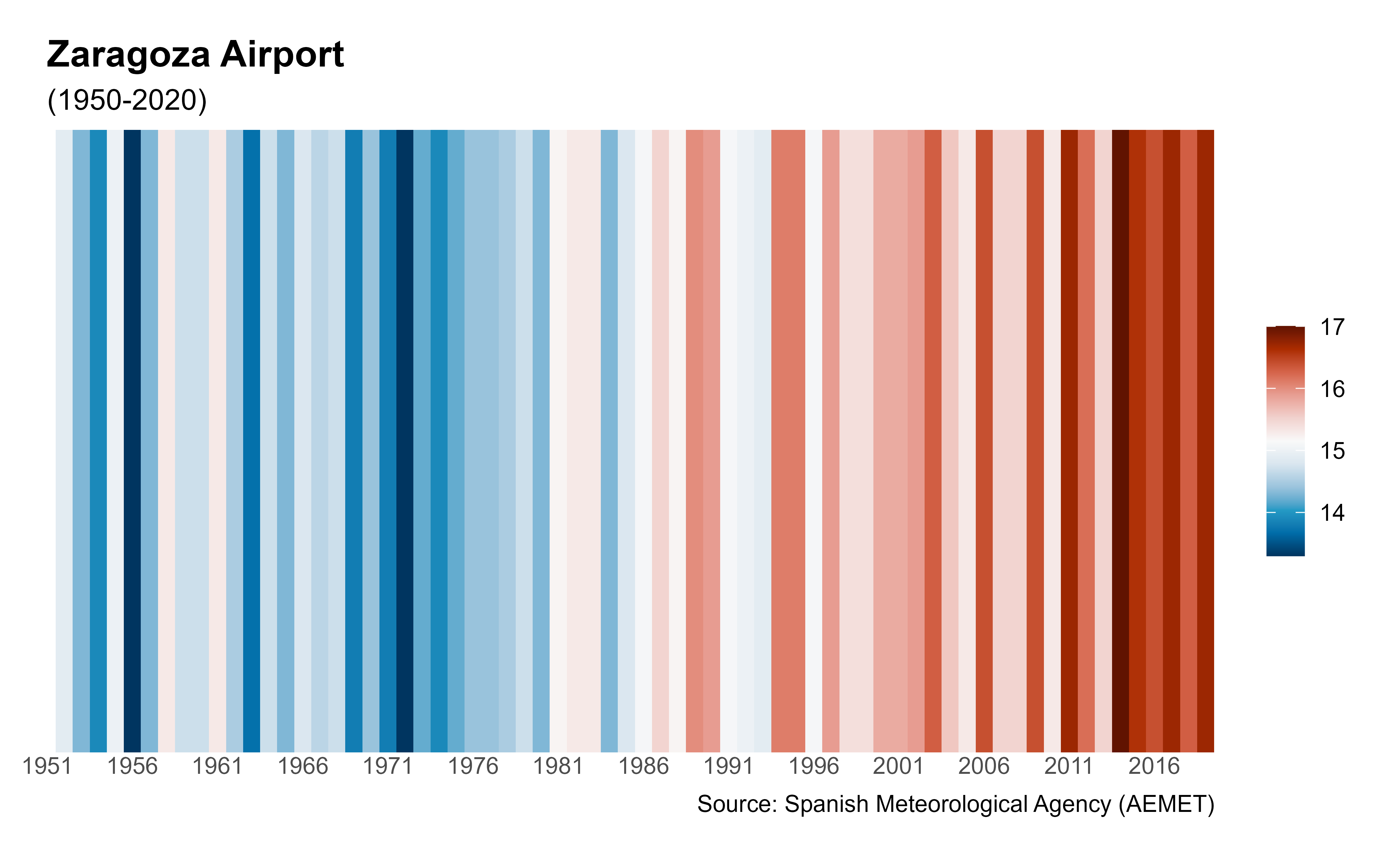
Professor Ed Hawkins of the University of Reading developed the "warming stripes" concept to communicate climate change risks as simply as possible. For more details, see ShowYourStripes.
See also
ggplot2::theme() for additional
arguments to ggstripes() and climaemet_9434_temp.
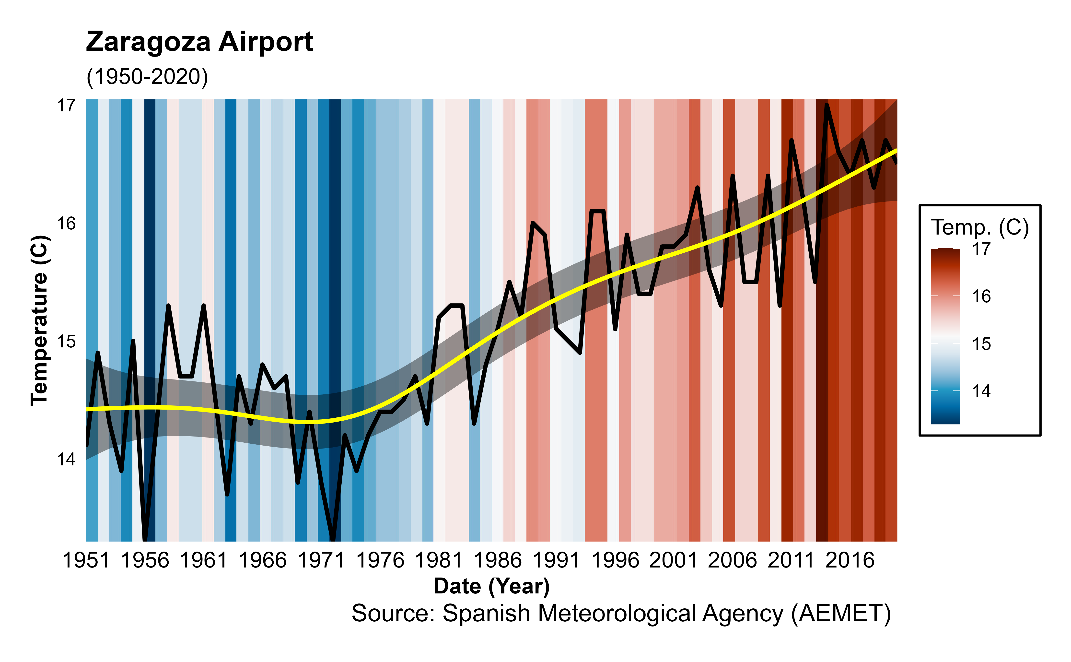
Warming stripes:
climatestripes_station()
Examples
# \donttest{
library(ggplot2)
data <- climaemet::climaemet_9434_temp
ggstripes(data, plot_title = "Zaragoza Airport") +
labs(subtitle = "(1950-2020)")
#> ℹ Plotting warming stripes.
#> Warning: Removed 2 rows containing missing values or values outside the scale range
#> (`geom_tile()`).
 ggstripes(data, plot_title = "Zaragoza Airport", plot_type = "trend") +
labs(subtitle = "(1950-2020)")
#> ℹ Plotting warming stripes with a temperature trend line.
#> Warning: Removed 2 rows containing missing values or values outside the scale range
#> (`geom_tile()`).
ggstripes(data, plot_title = "Zaragoza Airport", plot_type = "trend") +
labs(subtitle = "(1950-2020)")
#> ℹ Plotting warming stripes with a temperature trend line.
#> Warning: Removed 2 rows containing missing values or values outside the scale range
#> (`geom_tile()`).
 # }
# }