library(climaemet)
library(mapSpain) # Base maps of Spain
library(sf) # Spatial shape handling
library(terra) # Spatial raster handling
library(gstat) # Spatial interpolation
library(tidyverse) # Data handling
library(ggplot2) # Plots
library(tidyterra) # Plot SpatRasters with tidyterra
library(gifski) # Create an animationclimaemet retrieves data from weather stations available through the AEMET OpenData API. For spatial analysis and visualization, we extend point observations across Spain. This article interpolates climatology values using spatial interpolation, which is the process of using points with known values to estimate values at other unknown locations.
Initial configuration
For this analysis, we need the following libraries:
Retrieve data
We use daily climatology values for winter 2020–2021 in Spain. In the first half of January, Storm Filomena brought unusually heavy snowfall to parts of Spain, with Madrid recording its heaviest snowfall since 1971. The interpolation should make this event visible.
clim_data <- aemet_daily_clim(
  start = "2020-12-21",
  end = "2021-03-20",
  return_sf = TRUE
)
Keep only the stations on mainland Spain:
clim_data_clean <- clim_data |>
  # Exclude Canary Islands from analysis.
  filter(str_detect(provincia, "PALMAS|TENERIFE", negate = TRUE)) |>
  dplyr::select(fecha, tmed) |>
  # Exclude NAs.
  filter(!is.na(tmed))

summary(clim_data_clean$tmed)
#>    Min. 1st Qu.  Median    Mean 3rd Qu.    Max.
#> -16.200   5.500   9.000   8.369  11.800  23.200

ccaa_esp <- esp_get_ccaa(epsg = 4326) |>
  # Exclude Canary Islands from analysis.
  filter(ine.ccaa.name != "Canarias")

# Load a spatial object for Spain with mapSpain.
ggplot(ccaa_esp) +
  geom_sf() +
  geom_sf(data = clim_data_clean)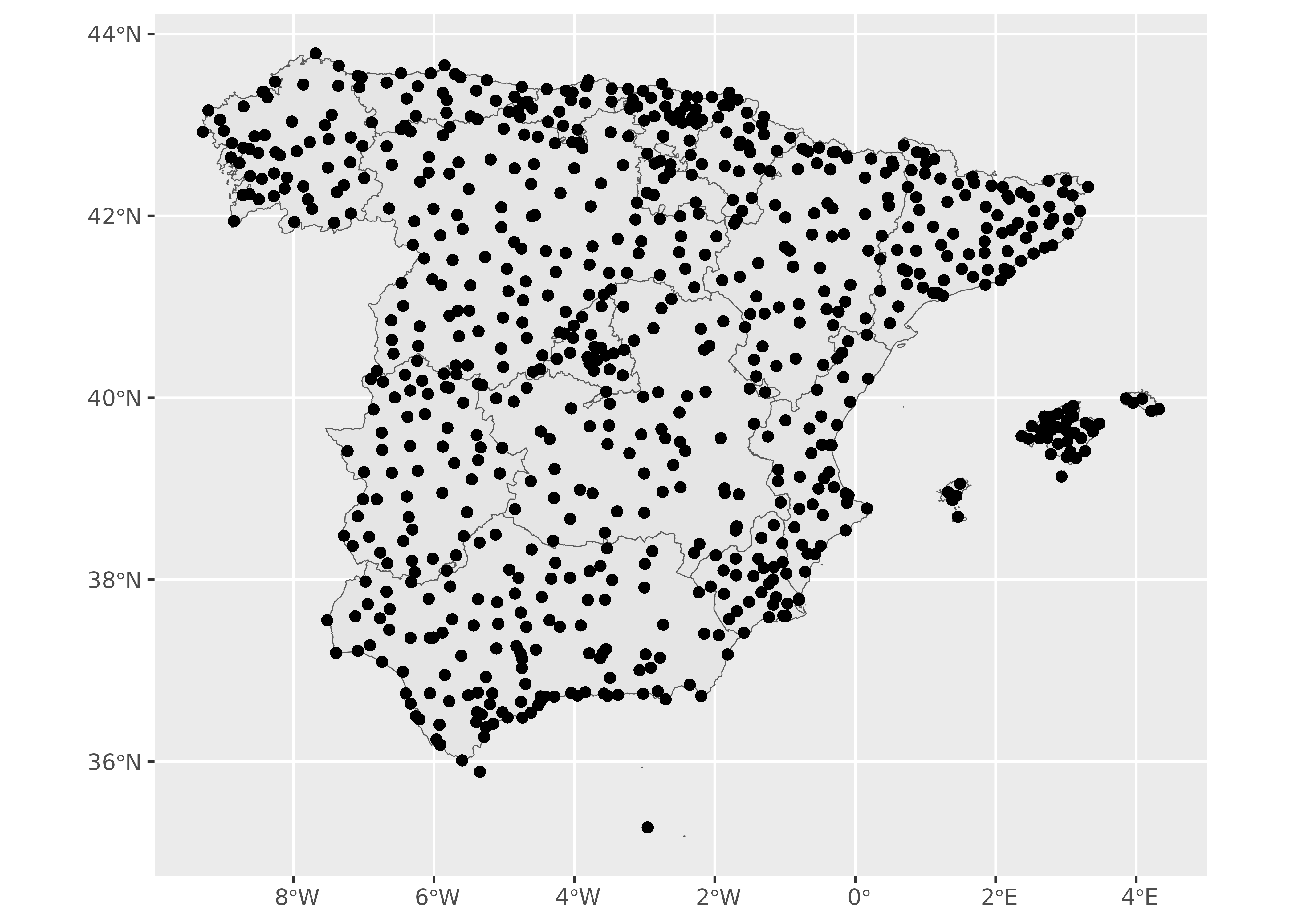
The observations are available only at weather stations, but we want to estimate values across the entire study area.
Filling the gaps: interpolation
Prediction at unobserved locations requires spatial interpolation. In this example, we use terra and apply the inverse distance weighting method, one of several spatial interpolation approaches. See Hijmans (2023) for a detailed explanation of this analysis in R.
The process is as follows:
- Create a spatial object (
SpatRaster) where the predicted values are applied. - Perform a spatial interpolation.
- Visualize the results.
Create a grid
The analysis requires a destination object representing the locations to predict. A common approach is to create a spatial grid (raster) that covers the target area.
In this example, we use terra to create a regular grid that we use for interpolation.
An important consideration in any spatial analysis or visualization is the coordinate reference system (CRS). We do not cover this in detail in this article, but we should mention a few key points:
- When using multiple spatial objects, ensure that all of them use the same CRS. This can be achieved by projecting the objects (i.e. transforming their coordinates) to the same CRS.
- Longitude/latitude coordinates are unprojected. When we project an object (for example, to a Mercator projection), we change the x/y values of every point. A projection transforms coordinates.
- To measure distance in meters, choose a projection appropriate for the region. Distances in longitude/latitude are not uniform: one degree of longitude is about 111 km at the equator but much smaller near the poles. Degrees divide a circle into equal angular segments, but the Earth’s meridians converge toward the poles, so ground distances vary with latitude.
In this exercise, we choose to project our objects to ETRS89 / UTM zone 30N EPSG:25830, which provides x and y values in meters and maximizes the accuracy for Spain.
clim_data_utm <- st_transform(clim_data_clean, 25830)
ccaa_utm <- st_transform(ccaa_esp, 25830)

# Note the original projection.

st_crs(ccaa_esp)$proj4string
#> [1] "+proj=longlat +datum=WGS84 +no_defs"

# Compare it with the UTM projection.

st_crs(ccaa_utm)$proj4string
#> [1] "+proj=utm +zone=30 +ellps=GRS80 +towgs84=0,0,0,0,0,0,0 +units=m +no_defs"
Create a regular grid with terra. The grid contains equally spaced cells across the bounding box of Spain.
Here we use a resolution of 5,000 m, so the grid cells are 5 by 5 km (25 square km):
Interpolate the data
Populate the empty grid with values predicted from the observations:
# Test with a single day.

test_day <- clim_data_utm |> filter(fecha == "2021-01-08")

# Interpolate temperature.
init_p <- test_day |>
  vect() |>
  as_tibble(geom = "XY")

gs <- gstat(
  formula = tmed ~ 1,
  locations = ~ x + y,
  data = init_p,
  set = list(idp = 2)
)

interp_temp <- interpolate(grd, gs)
#> [inverse distance weighted interpolation]
#> [inverse distance weighted interpolation]

# Plot with tidyterra.
ggplot() +
  geom_spatraster(data = interp_temp |> select(var1.pred)) +
  scale_fill_whitebox_c(
    palette = "bl_yl_rd",
    labels = scales::label_number(suffix = "°C")
  ) +
  labs(
    title = "(interpolated) temperature",
    subtitle = "2021-01-08"
  )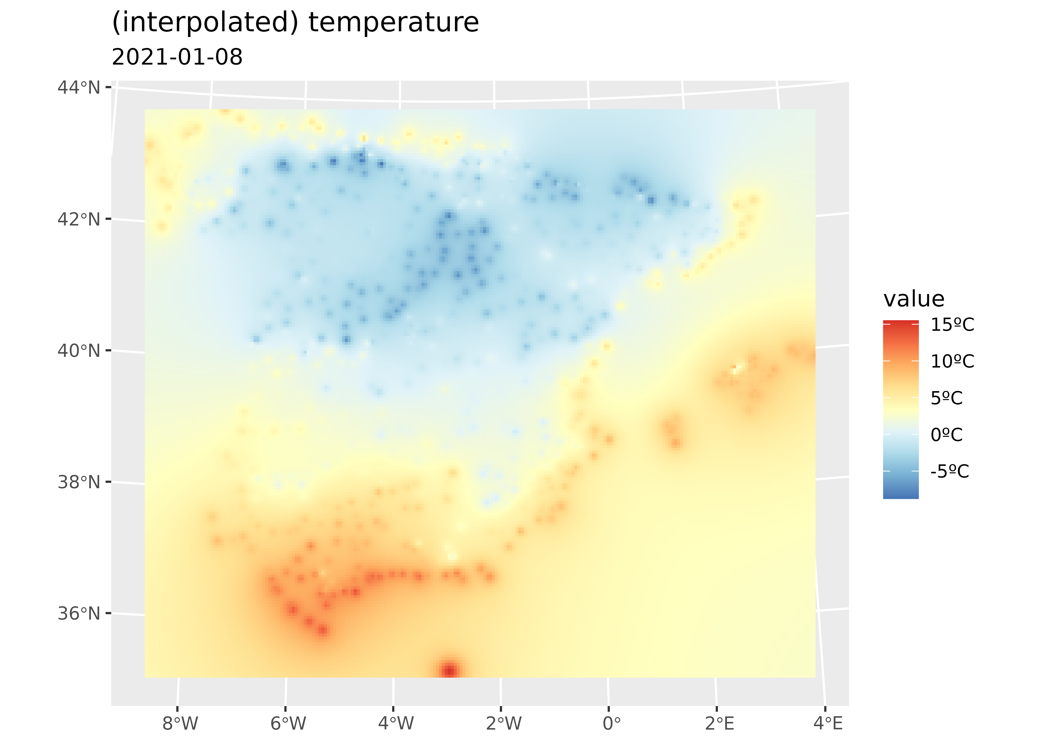
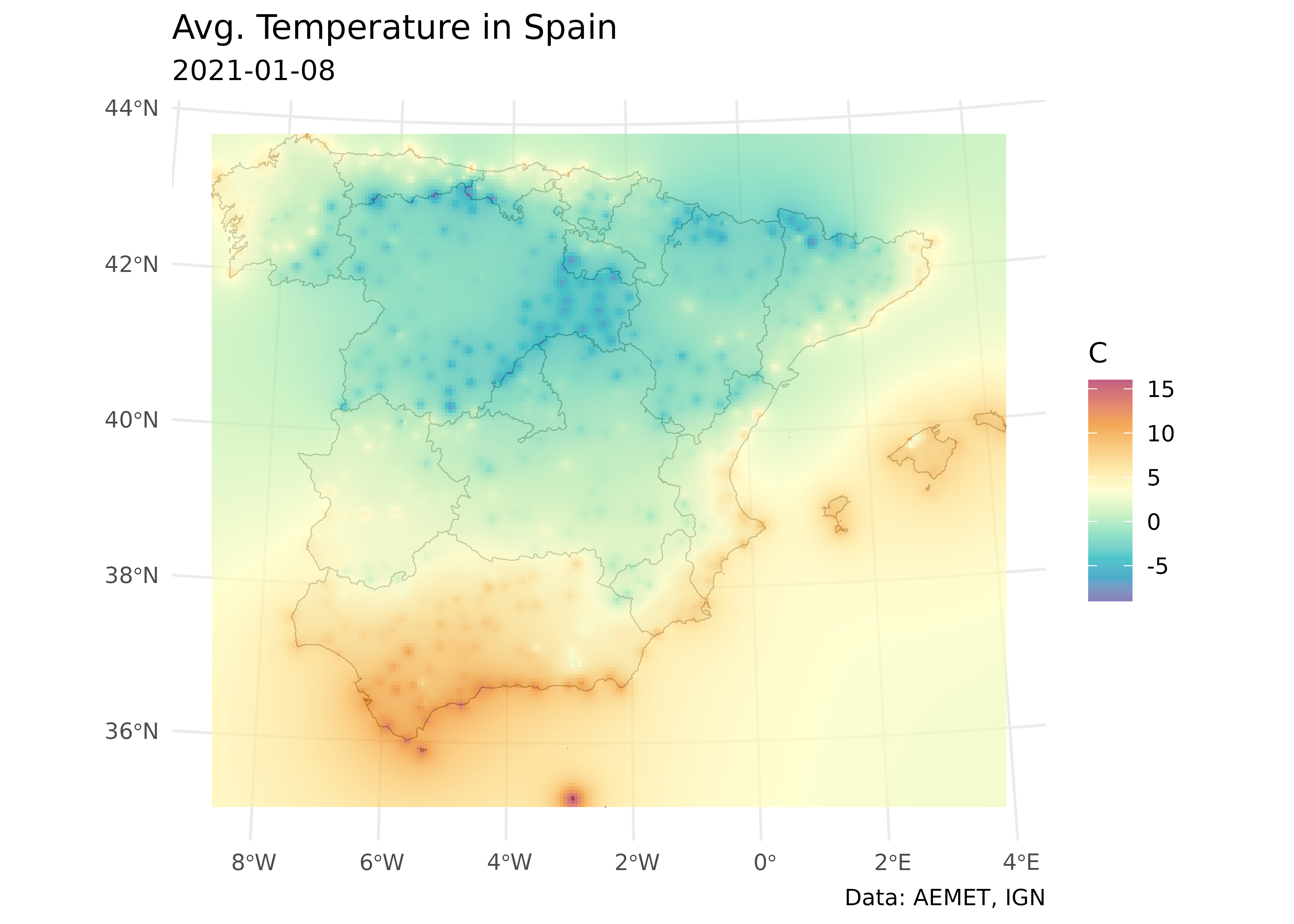
Create a polished ggplot2 plot. See Royé (2020) for further examples.
# Create a polished ggplot2 plot.
temp_values <- interp_temp |>
  pull(var1.pred) |>
  range(na.rm = TRUE)

# Get minimum and maximum interpolated values.
min_temp <- floor(min(temp_values))
max_temp <- ceiling(max(temp_values))

ggplot() +
  geom_sf(data = ccaa_utm, fill = "grey95") +
  geom_spatraster(data = interp_temp |> select(var1.pred)) +
  scale_fill_gradientn(
    colours = hcl.colors(11, "Spectral", rev = TRUE, alpha = 0.7),
    limits = c(min_temp, max_temp)
  ) +
  theme_minimal() +
  labs(
    title = "Average temperature in Spain",
    subtitle = "2021-01-08",
    caption = "Data: AEMET, IGN",
    fill = "°C"
  )
Animation
In this section, we loop over the dates to create a single SpatRaster with several layers, each one holding the interpolation for a specific date. After that, we create an animation to show how temperature changes through winter 2020–2021.
# Create a SpatRaster with a layer for each date.
dates <- sort(unique(clim_data_clean$fecha))

# Loop through days and create interpolations.
interp_list <- lapply(dates, function(x) {
  thisdate <- x
  tmp_day <- clim_data_utm |>
    filter(fecha == thisdate) |>
    vect() |>
    as_tibble(geom = "XY")

  gs_day <- gstat(formula = tmed ~ 1, locations = ~ x + y, data = tmp_day)
  interp_day <- interpolate(grd, gs_day, idp = 2.0) |>
    select(interpolated = var1.pred)

  names(interp_day) <- format(thisdate)

  interp_day
})

# Concatenate to a single SpatRaster.
interp_rast <- do.call(c, interp_list) |> mask(vect(ccaa_utm))

time(interp_rast) <- dates
Inspect the results:
interp_rast
#> class       : SpatRaster
#> size        : 193, 228, 90  (nrow, ncol, nlyr)
#> resolution  : 5000.706, 5006.959  (x, y)
#> extent      : -13882.95, 1126278, 3892802, 4859145  (xmin, xmax, ymin, ymax)
#> coord. ref. : ETRS89 / UTM zone 30N (EPSG:25830)
#> source(s)   : memory
#> names       : 2020-12-21, 2020-12-22, 2020-12-23, 2020-12-24, 2020-12-25, 2020-12-26, ...
#> min values  :   0.844198,   4.199887,   2.470233,  -1.814927,     -7.807,  -9.228323, ...
#> max values  :  18.997771,   18.86457,  16.683431,  16.854208,  16.010724,  14.617574, ...
#> time (days) : 2020-12-21 to 2021-03-20 (90 steps)

nlyr(interp_rast)
#> [1] 90

head(names(interp_rast))
#> [1] "2020-12-21" "2020-12-22" "2020-12-23" "2020-12-24" "2020-12-25"
#> [6] "2020-12-26"

# Create a faceted map with selected dates.

ggplot() +
  geom_spatraster(data = interp_rast |> select(1:16)) +
  facet_wrap(~lyr) +
  scale_fill_whitebox_c(palette = "pi_y_g", alpha = 1) +
  theme_minimal() +
  theme(axis.text = element_blank()) +
  labs(title = "Temperatures (selected)")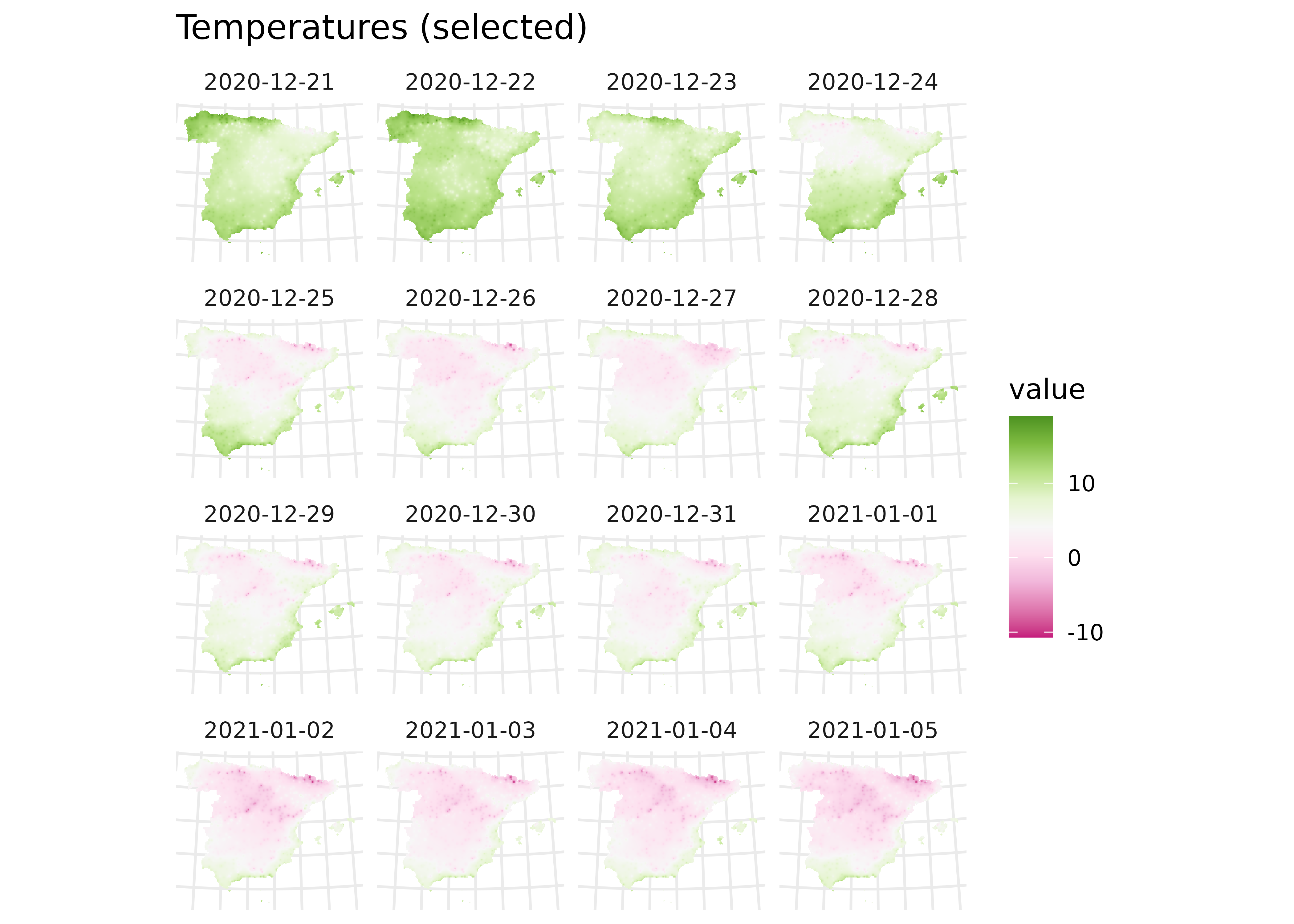
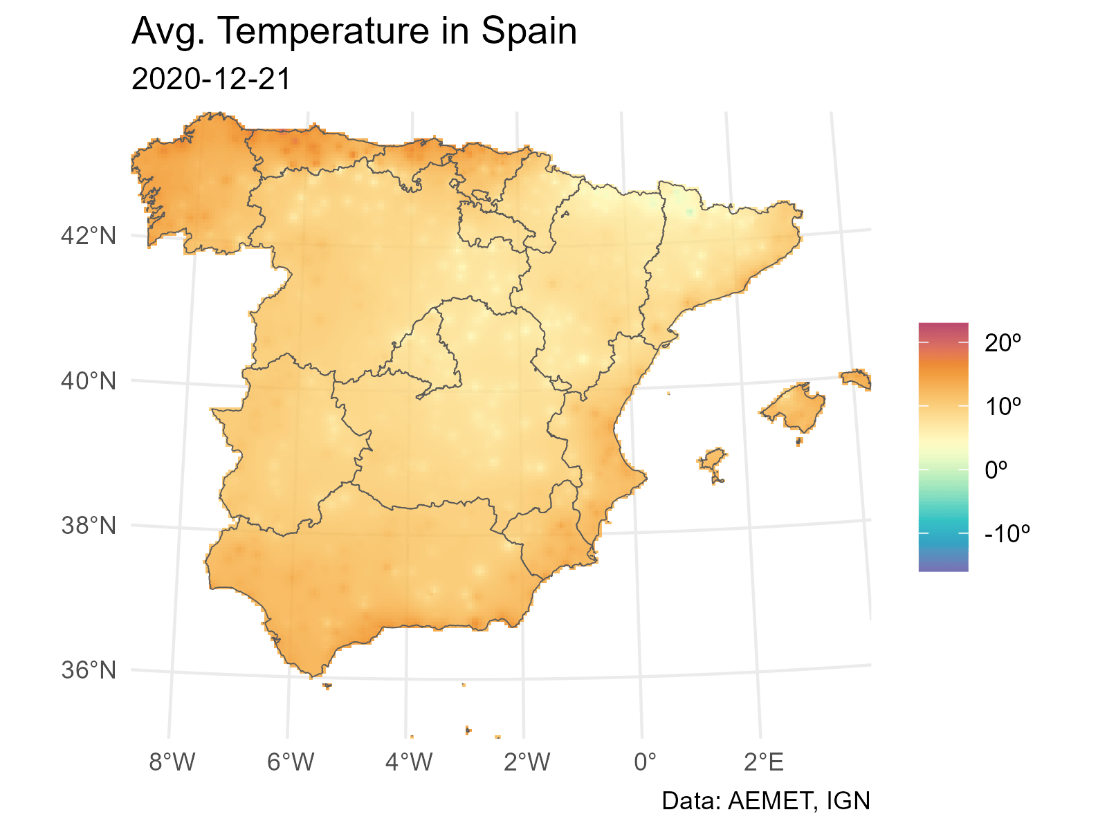
Finally, loop through the layers to produce one PNG file per date. Then combine the PNG files into a GIF with gifski.
# Extend and animate the results.
# Create GIF.

# Use a common scale from all observed values in each layer.
allvalues <- values(interp_rast, mat = FALSE, na.rm = TRUE)

min_temp2 <- floor(min(allvalues))
max_temp2 <- ceiling(max(allvalues))

# Loop through all the layers.
all_layers <- names(interp_rast)

for (i in seq_along(all_layers)) {
  # Create a GIF for each date.
  this <- all_layers[i]
  interp_rast_day <- interp_rast |> select(all_of(this))

  this_date <- as.Date(gsub("interp_", "", this, fixed = TRUE))

  g <- ggplot() +
    geom_spatraster(data = interp_rast_day) +
    geom_sf(data = ccaa_utm, fill = NA) +
    coord_sf(expand = FALSE) +
    scale_fill_gradientn(
      colours = hcl.colors(20, "Spectral", rev = TRUE, alpha = 0.8),
      limits = c(min_temp2, max_temp2),
      na.value = NA,
      labels = scales::label_number(suffix = "°C")
    ) +
    theme_minimal() +
    labs(
      title = "Average temperature in Spain",
      subtitle = this_date,
      caption = "Data: AEMET, IGN",
      fill = ""
    )

  tmp <- file.path(tempdir(), paste0(this, ".png"))
  ggsave(tmp, g, width = 1600, height = 1200, units = "px", bg = "white")
}
Use gifski to create the animation:
References
Hijmans, Robert J. 2023. “Interpolation.” Chap. 4 in Spatial Data Analysis with R. https://rspatial.org/analysis/4-interpolation.html.
Royé, Dominic. 2020. “Climate Animation of Maximum Temperatures.” October 11. https://dominicroye.github.io/blog/climate-animation-maximum-temperature/.