What are spatial data?
Geospatial data are any data that contain information about a specific location on the Earth’s surface. Spatial data arise in a myriad of fields and applications, so there are also many spatial data types. Cressie (1993) provides a simple, useful classification of spatial data:
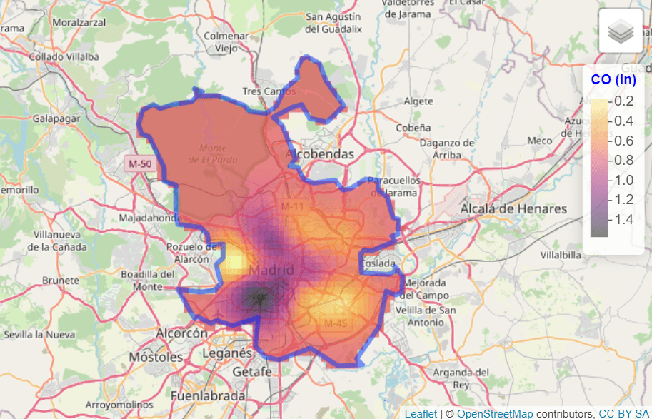
- Geostatistical data. For example, the level of log CO in Madrid:
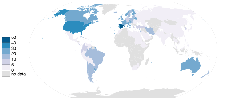
- Lattice data. For example, organ donor rate by country.
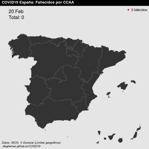
- Point patterns. For example, COVID deaths per day in Spain.
See Montero et al. (2015) for more details. In this work, we focus on geostatistical data.
What do we need to carry out a geostatistical data analysis in R?
Some useful libraries we use throughout this article are:
library(climaemet) # Meteorological data
library(mapSpain) # Base maps of Spain
library(classInt) # Classification
library(terra) # Raster handling
library(sf) # Spatial shape handling
library(gstat) # Spatial interpolation
library(geoR) # Spatial analysis
library(tidyverse) # Collection of R packages designed for data science
library(tidyterra) # Tidyverse methods for the terra package
Where can we find geostatistical data?
In this article, we deal with geostatistical data. Specifically, we model the air temperature in Spain on 8 January 2021.
We download the data with the climaemet package (>= 1.0.0) (Pizarro et al. 2021) in R. climaemet allows us to download climate data from the Spanish Meteorological Agency (AEMET) directly using the AEMET API. The package is available on CRAN:
# Install climaemet.
install.packages("climaemet")
API key
To download data from AEMET, you also need a free API key, which you can get here.
What is the structure of geostatistical data?
Geostatistical data arise when the domain under study is a fixed set D that is continuous. That is, (i) Z(s) can be observed at any point of the domain (continuous) and (ii) the points in D are non-stochastic (fixed, D is the same for all realizations of the spatial random function).
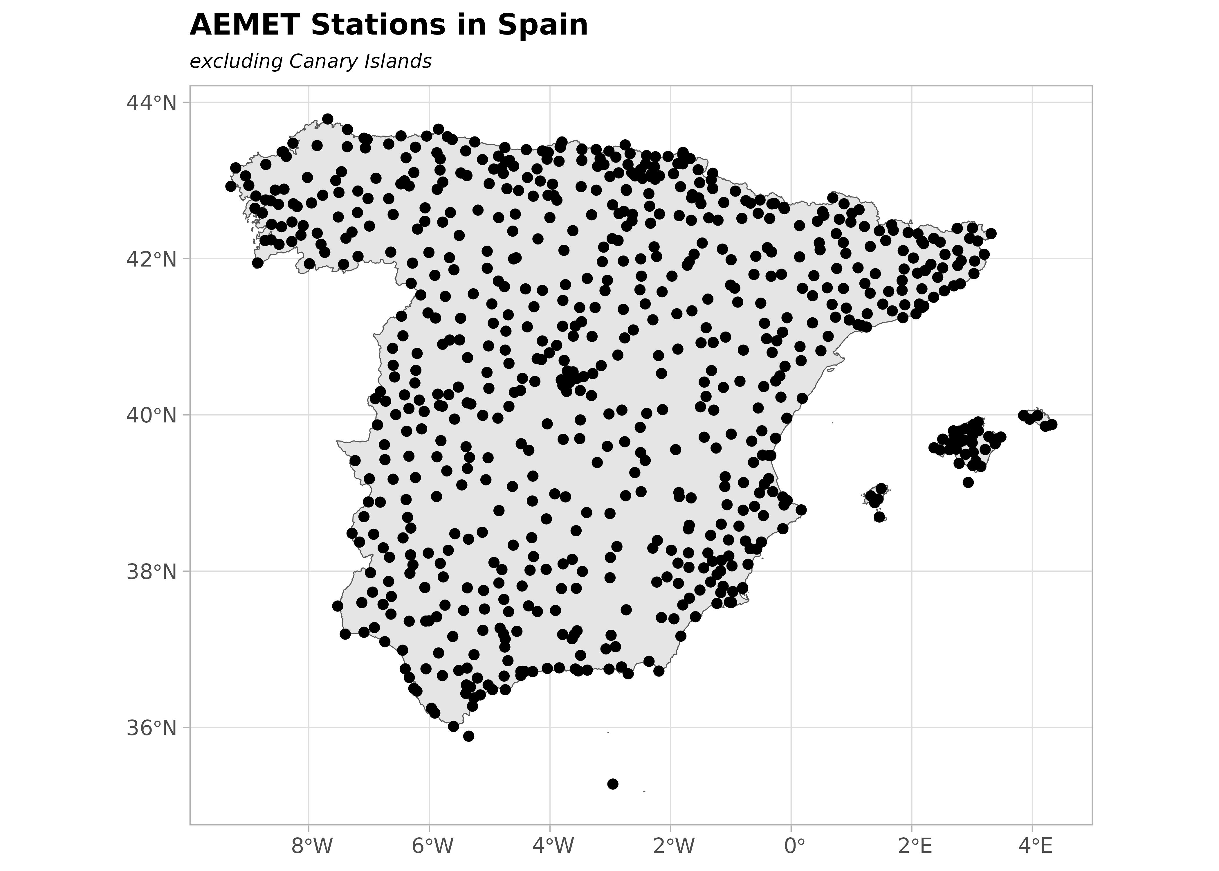
First, take a look at the characteristics of the stations. We are interested in latitude and longitude attributes.
stations <- aemet_stations()

# Have a look at the data.
stations |>
  dplyr::select(name = nombre, latitude = latitud, longitude = longitud) |>
  head() |>
knitr::kable(caption = "Preview of AEMET stations")| name | latitude | longitude |
|---|---|---|
| ESCORCA, LLUC | 39.82333 | 2.885833 |
| SÓLLER, PUERTO | 39.79556 | 2.691389 |
| BANYALBUFAR | 39.68917 | 2.512778 |
| ANDRATX - SANT ELM | 39.57944 | 2.368889 |
| CALVIÀ, ES CAPDELLÀ | 39.55139 | 2.466389 |
| PALMA, PUERTO | 39.55417 | 2.625278 |
Next, we extract the data. Here, we select the daily values of 8 January 2021:
# Select data.
date_select <- "2021-01-08"

clim_data <- aemet_daily_clim(
  start = date_select,
  end = date_select,
  return_sf = TRUE
)
Now, we examine the possible variables that can be analyzed. We are interested in minimum daily temperature named tmin, although the API also provides other interesting information:
names(clim_data)
#>  [1] "fecha"       "indicativo"  "nombre"      "provincia"   "altitud"
#>  [6] "tmed"        "prec"        "tmin"        "horatmin"    "tmax"
#> [11] "horatmax"    "hrMedia"     "hrMax"       "horaHrMax"   "hrMin"
#> [16] "horaHrMin"   "dir"         "velmedia"    "racha"       "horaracha"
#> [21] "presMax"     "horaPresMax" "presMin"     "horaPresMin" "sol"
#> [26] "geometry"
In this step, we select the variable of interest for each station. For simplicity, we will remove the Canary Islands in this exercise:
clim_data_clean <- clim_data |>
  # Exclude Canary Islands from analysis.
  filter(str_detect(provincia, "PALMAS|TENERIFE", negate = TRUE)) |>
  dplyr::select(fecha, tmin) |>
  # Exclude NAs.
  filter(!is.na(tmin))

# Plot with outline of Spain.
esp_sf <- esp_get_ccaa(epsg = 4326) |>
  # Exclude Canary Islands from analysis.
  filter(ine.ccaa.name != "Canarias") |>
  # Group the whole country.
  st_union()

ggplot(esp_sf) +
  geom_sf() +
  geom_sf(data = clim_data_clean) +
  theme_light() +
  labs(
    title = "AEMET stations in Spain",
    subtitle = "excluding Canary Islands"
  ) +
  theme(
    plot.title = element_text(
      size = 12,
      face = "bold"
    ),
    plot.subtitle = element_text(
      size = 8,
      face = "italic"
    )
  )
Now, plot the values as a choropleth map:
# Use common breaks and palette throughout the article.
br_paper <- c(-Inf, seq(-20, 20, 2.5), Inf)
pal_paper <- hcl.colors(15, "PuOr", rev = TRUE)

ggplot(clim_data_clean) +
  geom_sf(data = esp_sf, fill = "grey95") +
  geom_sf(aes(fill = tmin), shape = 21, size = 4, alpha = 0.7) +
  labs(fill = "Min. temp") +
  scale_fill_gradientn(
    colours = pal_paper,
    breaks = br_paper,
    labels = scales::label_number(suffix = "°"),
    guide = "legend"
  ) +
  theme_light() +
  labs(
    title = "Minimum temperature",
    subtitle = format(as.Date(date_select), "%d %b %Y")
  ) +
  theme(
    plot.title = element_text(
      size = 12,
      face = "bold"
    ),
    plot.subtitle = element_text(
      size = 8,
      face = "italic"
    )
  )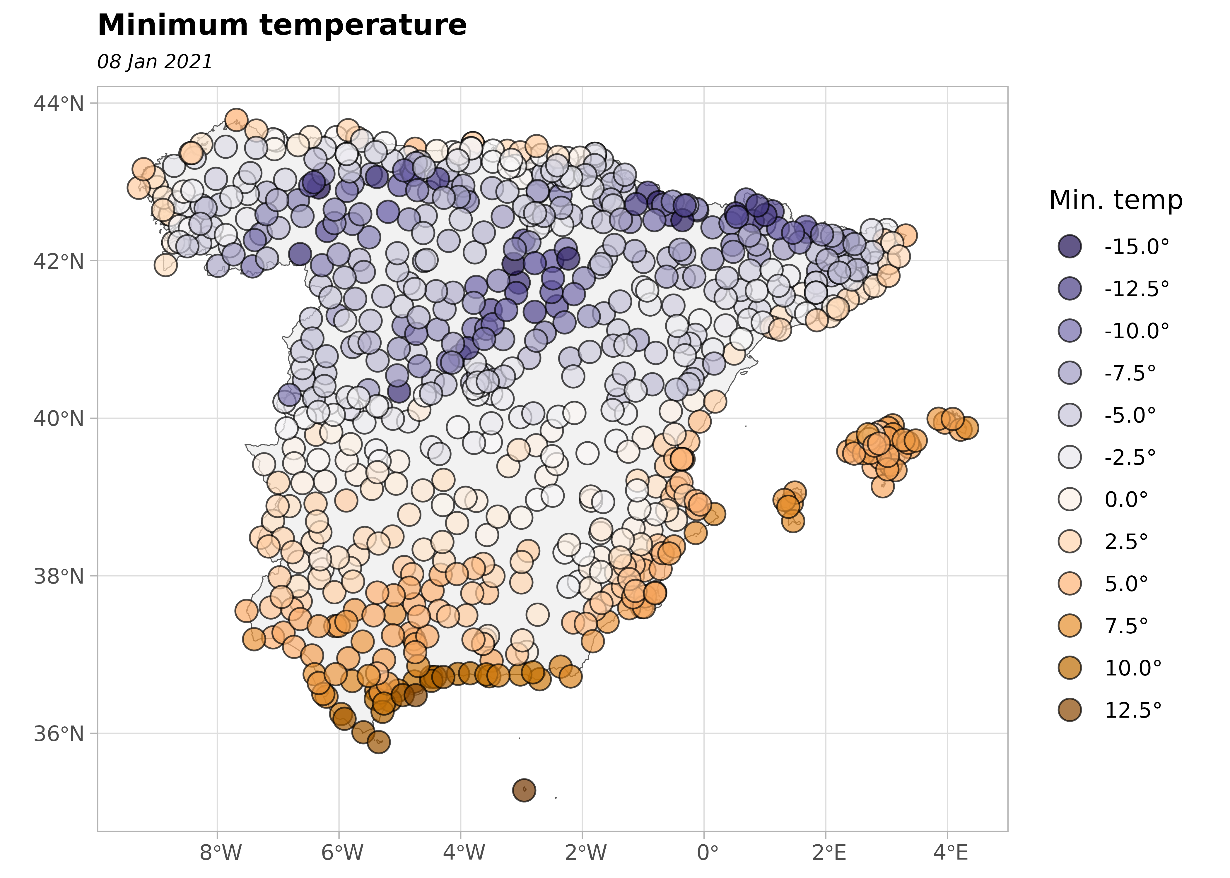
Are the observations independent or do they exhibit spatial dependence?
The First Law of Geography states that Everything is related to everything else, but near things are more related than distant things (Tobler 1969). This law is the basis of the fundamental concepts of spatial dependence and spatial autocorrelation.
In our study, we can observe positive spatial dependence: high temperature values are all found together in the south of Spain and low temperatures are found together in the north of Spain.
clim_data_clean |>
  st_drop_geometry() |>
  select(tmin) |>
  summarise(across(
    everything(),
    list(
      min = min,
      max = max,
      median = median,
      sd = sd,
      n = ~ sum(!is.na(.x)),
      q25 = ~ quantile(.x, 0.25),
      q75 = ~ quantile(., 0.75)
    ),
    .names = "{.fn}"
  )) |>
knitr::kable()| min | max | median | sd | n | q25 | q75 |
|---|---|---|---|---|---|---|
| -15.1 | 13.6 | -1.6 | 5.616639 | 743 | -5.3 | 2.85 |
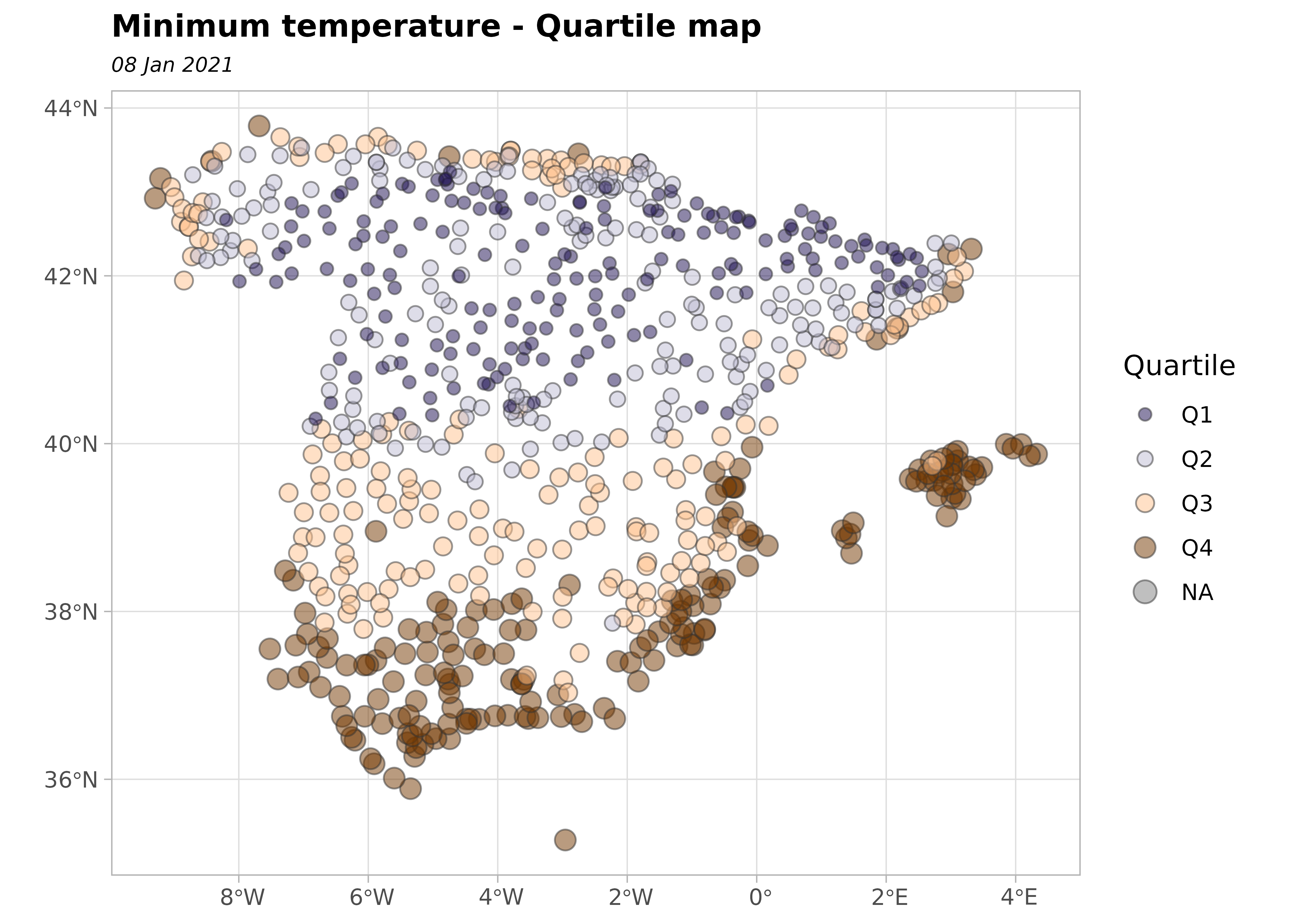
In the next plot, we divide the minimum temperature into quartiles to visualize the spatial distribution of values.
bubble <- clim_data_clean |>
  arrange(desc(tmin))

# Create quartiles.
cuart <- classIntervals(bubble$tmin, n = 4)

bubble$quart <- cut(
  bubble$tmin,
  breaks = cuart$brks,
  labels = paste0("Q", seq(1:4))
)

ggplot(bubble) +
  geom_sf(
    aes(size = quart, fill = quart),
    colour = "grey20",
    alpha = 0.5,
    shape = 21
  ) +
  scale_size_manual(values = c(2, 2.5, 3, 3.5)) +
  scale_fill_manual(values = hcl.colors(4, "PuOr", rev = TRUE)) +
  theme_light() +
  labs(
    title = "Minimum temperature - Quartile map",
    subtitle = format(as.Date(date_select), "%d %b %Y"),
    fill = "Quartile",
    size = "Quartile"
  ) +
  theme(
    plot.title = element_text(size = 12, face = "bold"),
    plot.subtitle = element_text(size = 8, face = "italic")
  )
Preparing the data as a spatial object
An important consideration in any spatial analysis or visualization is the coordinate reference system (CRS). In this exercise, we choose to project our objects to ETRS89 / UTM zone 30N EPSG:25830, which provides projected x and y values in meters and maximizes the accuracy for Spain.
clim_data_utm <- st_transform(clim_data_clean, 25830)

esp_sf_utm <- st_transform(esp_sf, 25830)
Creating a grid for the spatial prediction
To predict values at locations where no measurements have been made, we need to create a grid of locations and perform an interpolation. In this article, we use the terra package for working with spatial grids (SpatRaster objects). Hijmans and Ghosh (2023) provides a detailed explanation on how to perform spatial interpolation using the terra and gstat packages.
This grid is composed of equally spaced points over the full bounding box of Spain. Most squares do not have any stations, so they do not have observations. However, we use the values of the cells that contain stations to interpolate the data.
# Create a 5 x 5 km grid (25 square km).
# The resolution is based on the projection unit, in this case meters.
grd <- rast(vect(esp_sf_utm), res = c(5000, 5000))

cellSize(grd)
#> class       : SpatRaster
#> size        : 193, 228, 1  (nrow, ncol, nlyr)
#> resolution  : 5000, 5000  (x, y)
#> extent      : -13882.95, 1126117, 3892802, 4857802  (xmin, xmax, ymin, ymax)
#> coord. ref. : ETRS89 / UTM zone 30N (EPSG:25830)
#> source(s)   : memory
#> name        :     area
#> min value   : 24785392
#> max value   : 25019998
Some additional steps are needed to prepare the data for spatial interpolation.
# Some points are duplicated, so remove them.

clim_data_clean_nodup <- clim_data_utm |>
  distinct(geometry, .keep_all = TRUE)

nrow(clim_data_utm)
#> [1] 743

nrow(clim_data_clean_nodup)
#> [1] 738

clim_data_clean_nodup
#> Simple feature collection with 738 features and 2 fields
#> Geometry type: POINT
#> Dimension:     XY
#> Bounding box:  xmin: -13501.2 ymin: 3903695 xmax: 1126597 ymax: 4858794
#> Projected CRS: ETRS89 / UTM zone 30N
#> # A tibble: 738 × 3
#>    fecha       tmin           geometry
#>    <date>     <dbl>        <POINT [m]>
#>  1 2021-01-08   4.2 (672170.6 4229216)
#>  2 2021-01-08   0.4 (974469.6 4626714)
#>  3 2021-01-08   5.9 (342907.5 4117910)
#>  4 2021-01-08  -7.6 (246984.3 4576961)
#>  5 2021-01-08   0.1 (740805.4 4456820)
#>  6 2021-01-08  -9.7 (433670.8 4553921)
#>  7 2021-01-08   1.3 (691017.1 4333929)
#>  8 2021-01-08   0.6 (179243.6 4231942)
#>  9 2021-01-08  -4.9 (227110.4 4495959)
#> 10 2021-01-08   3.8   (714492 4319880)
#> # ℹ 728 more rows
Structural analysis of the spatial dependence
Exploratory spatial data analysis (ESDA)
Exploratory Data Analysis (EDA) is the first important step of data modeling, so ESDA is also the first step in spatial statistics. What do the data tell us about the relationship between X and Y coordinates and the variable tmin?
To answer this question, we summarize our spatial object and examine: (i) the number of data points, (ii) the coordinates, (iii) the distances, and (iv) the data.
clim_data_clean_nodup_geor <- clim_data_clean_nodup |>
  st_coordinates() |>
  as.data.frame() |>
  bind_cols(st_drop_geometry(clim_data_clean_nodup)) |>
  as.geodata(coords.col = 1:2, data.col = "tmin")

summary(clim_data_clean_nodup_geor)
#> Number of data points: 738
#>
#> Coordinates summary
#>             X       Y
#> min  -13501.2 3903695
#> max 1126597.2 4858794
#>
#> Distance summary
#>          min          max
#> 2.252607e+01 1.187437e+06
#>
#> Data summary
#>      Min.   1st Qu.    Median      Mean   3rd Qu.      Max.
#> -15.10000  -5.30000  -1.60000  -1.38523   2.90000  13.60000
Second, we generate several exploratory geostatistical plots. The first is a quartile map. The next two show tmin against the X and Y coordinates and the last one is a histogram of the tmin values.
plot(clim_data_clean_nodup_geor)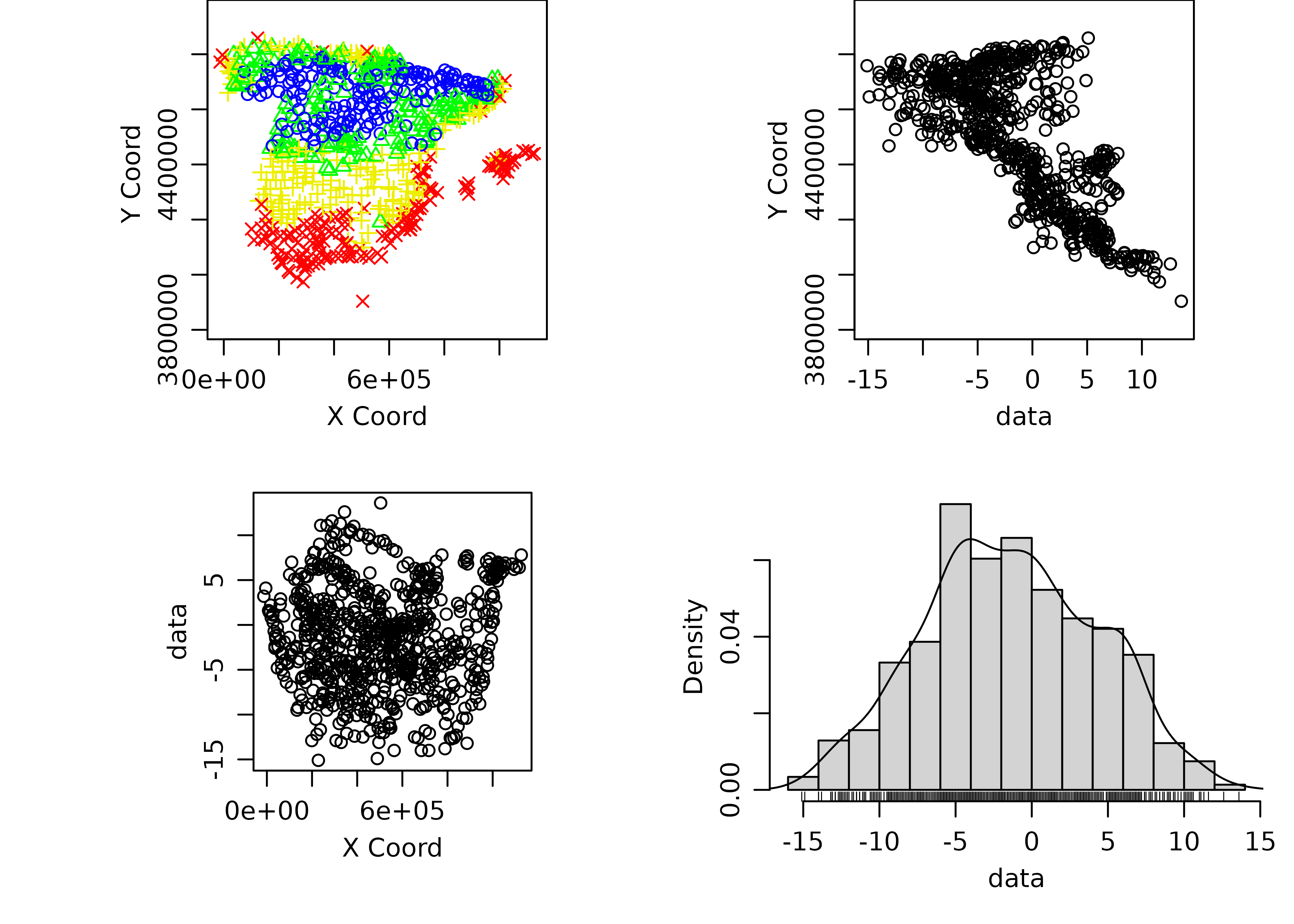
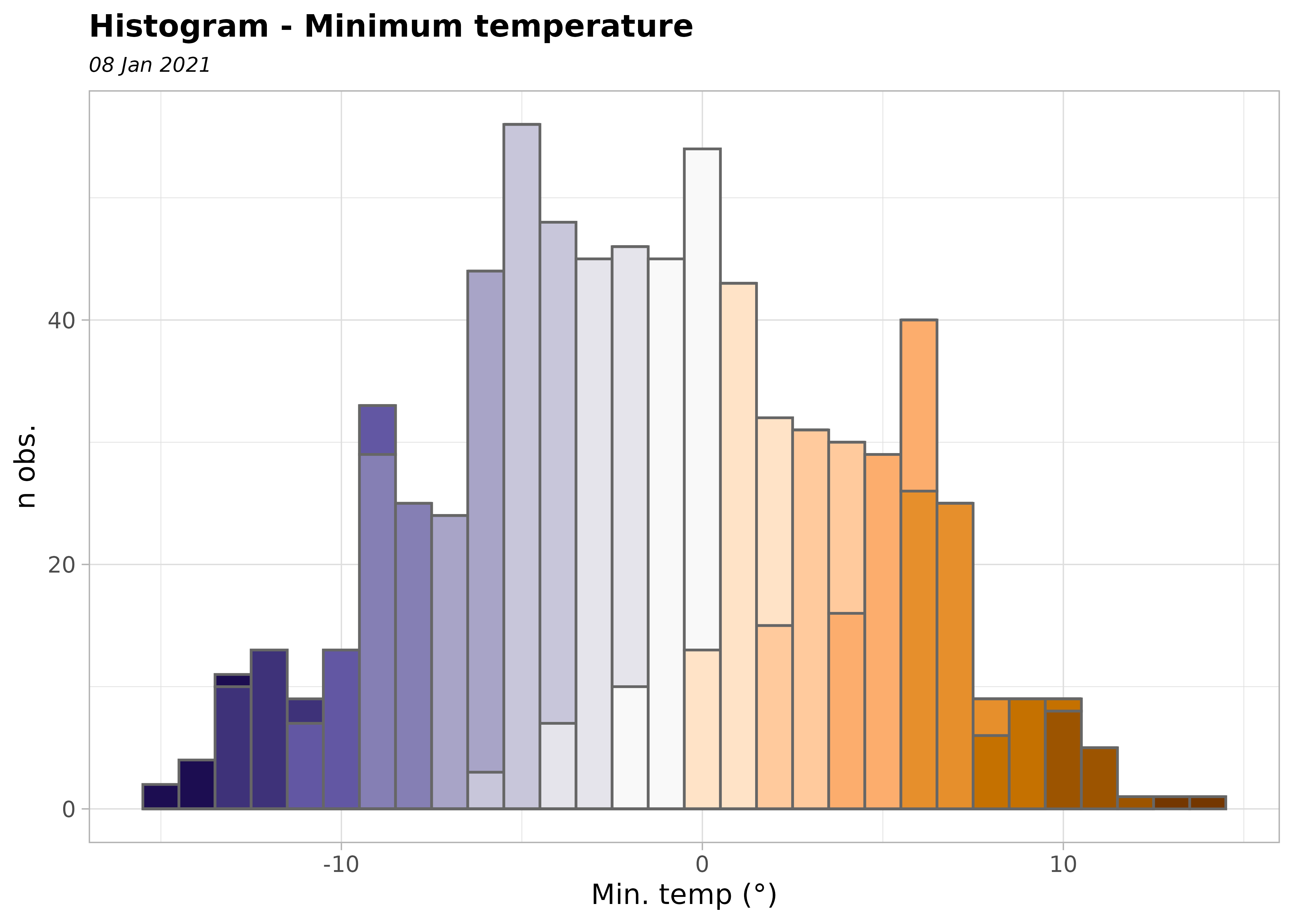
From the histogram, we see that the dataset is approximately Gaussian. Note that kriging provides the Best Linear Unbiased Predictor BLUP.
ggplot(clim_data_clean_nodup, aes(x = tmin)) +
  geom_histogram(
    aes(fill = cut(tmin, 15)),
    color = "grey40",
    binwidth = 1,
    show.legend = FALSE
  ) +
  scale_fill_manual(values = pal_paper) +
  labs(y = "n obs.", x = "Min. temp (°)") +
  theme_light() +
  labs(
    title = "Histogram - Minimum temperature",
    subtitle = format(as.Date(date_select), "%d %b %Y")
  ) +
  theme(
    plot.title = element_text(size = 12, face = "bold"),
    plot.subtitle = element_text(size = 8, face = "italic")
  )
The semivariogram
The semivariogram function is the keystone of geostatistical prediction. Following Montero et al. (2015), we formulate this question: How do we express in a function the structure of the spatial dependence or correlation present in the realization observed? The answer to this question, known in the geostatistics literature as the structural analysis of the spatial dependence, or, simply, the structural analysis, is a key issue in the subsequent process of optimal prediction (kriging), as the success of the kriging methods depends on the functions yielding information about the spatial dependence detected.
The functions referred to above are covariance functions and semivariograms, but they must meet a series of requirements. Because we only have the observed realization, in practice, the covariance functions and semivariograms derived from it may not satisfy these requirements. For this reason, one of the theoretical models (also called the valid models) that do comply must be fitted to it.
There are several R packages for geostatistical analysis, including two widely used options: geoR (Ribeiro Jr and Diggle 2001) and gstat (Pebesma 2004; Gräler et al. 2016).
The semivariogram is, generally, a non-decreasing monotone function, so that the variability of the first increments of the random functions increases with distance.
We are going to generate the (omnidirectional) empirical semivariogram of our data, which, in a second step, has to be fitted to a theoretical one.
vario_geor <- variog(
  clim_data_clean_nodup_geor,
  coords = clim_data_clean_nodup_geor$coords,
  data = clim_data_clean_nodup_geor$data,
  uvec = seq(0, 1000000, l = 25)
)
#> variog: computing omnidirectional variogram

plot(vario_geor, pch = 20)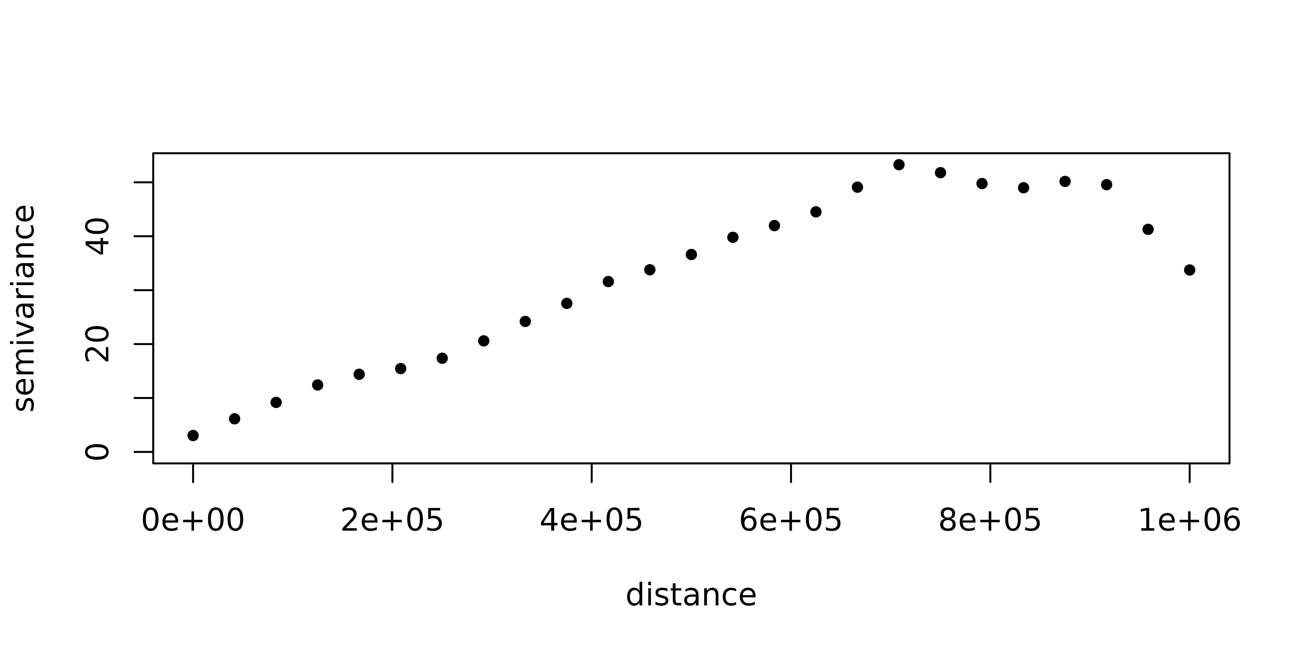
eyefit() is an interactive function that fits the parameters of the semivariogram by eye. It is an intuitive function to play with the types and parameters of the semivariogram. It can help you fit the empirical semivariogram to a theoretical one. Of course, there are other statistical methods to fit the semivariogram: Ordinary Least Squares (OLS), Weighted Least Squares (WLS), Maximum Likelihood (ML), Restricted Maximum Likelihood (REML).
Run it locally.
eyefit(vario_geor)With geoR::eyefit(), we observed that there are different types of semivariograms and each type contains several parameters that have to be fitted.
The main types of semivariograms are:
- Spherical.
- Exponential.
- Gaussian.
- Hole effect.
- K-Bessel.
- J-Bessel.
- Stable.
- Matérn.
- Circular.
- Nugget.
A graphical summary of the most common spatial semivariogram models can be found here:
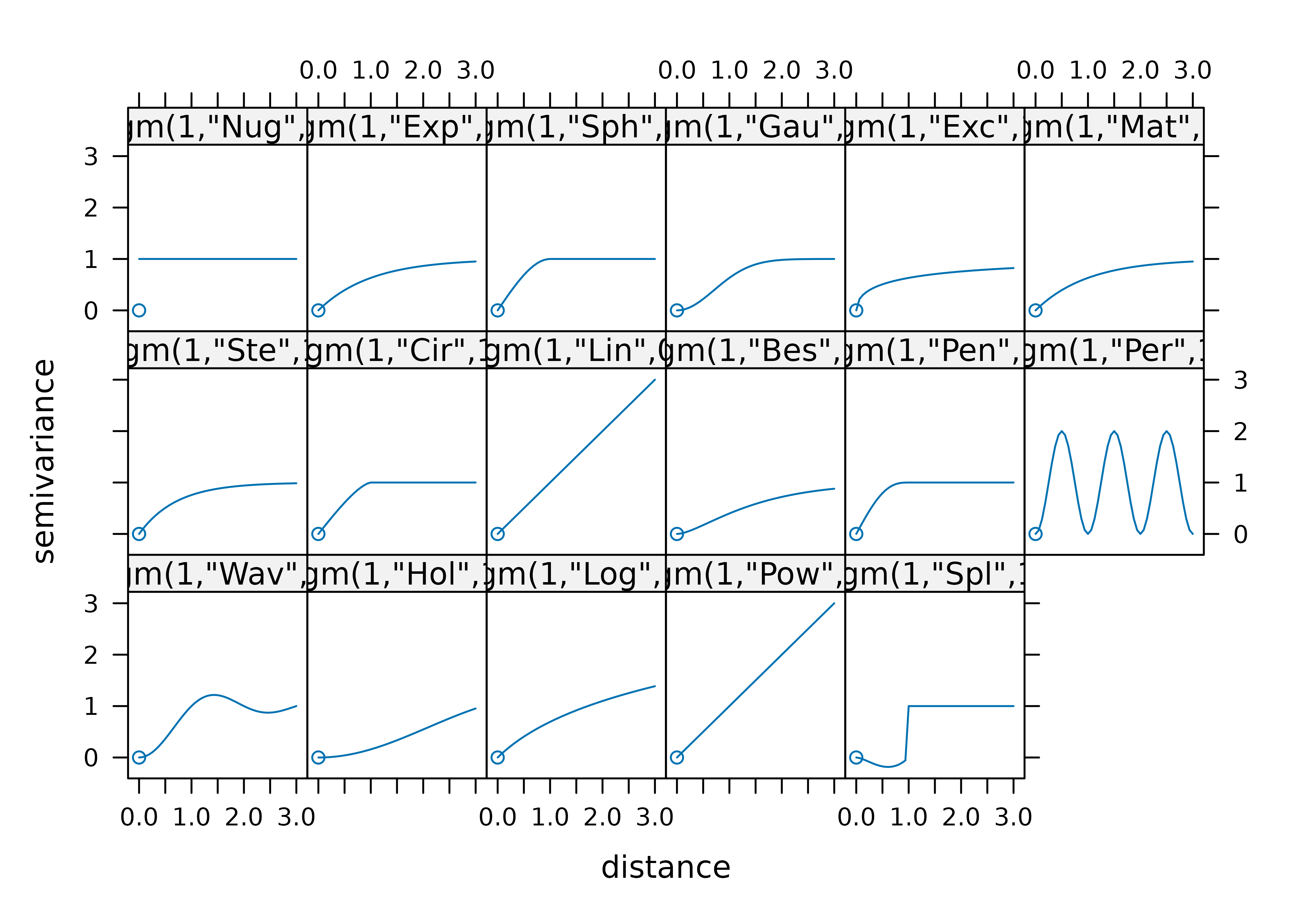
Regarding the parameters, the main ones are:
- Sill: Defined as the a priori variance of the random function.
- Range: The distance at which the sill is reached, which defines the threshold of spatial dependence.
- Nugget: The value at which the semivariogram intercepts the y-value. Theoretically, at zero separation distance, the semivariogram value is 0. The nugget effect can be attributed to measurement errors or spatial sources of variation at distances smaller than the sampling interval or both.
For a detailed study of the semivariogram function, see Montero et al. (2015).
Now, we plot the empirical semivariogram of our data (again) with gstat::variogram and we check the semivariogram in four directions (0°, 45°, 90°, 135°).
vgm_dir <- variogram(
  tmin ~ 1,
  clim_data_clean_nodup,
  cutoff = 1000000,
  alpha = c(0, 45, 90, 135)
)

plot(vgm_dir)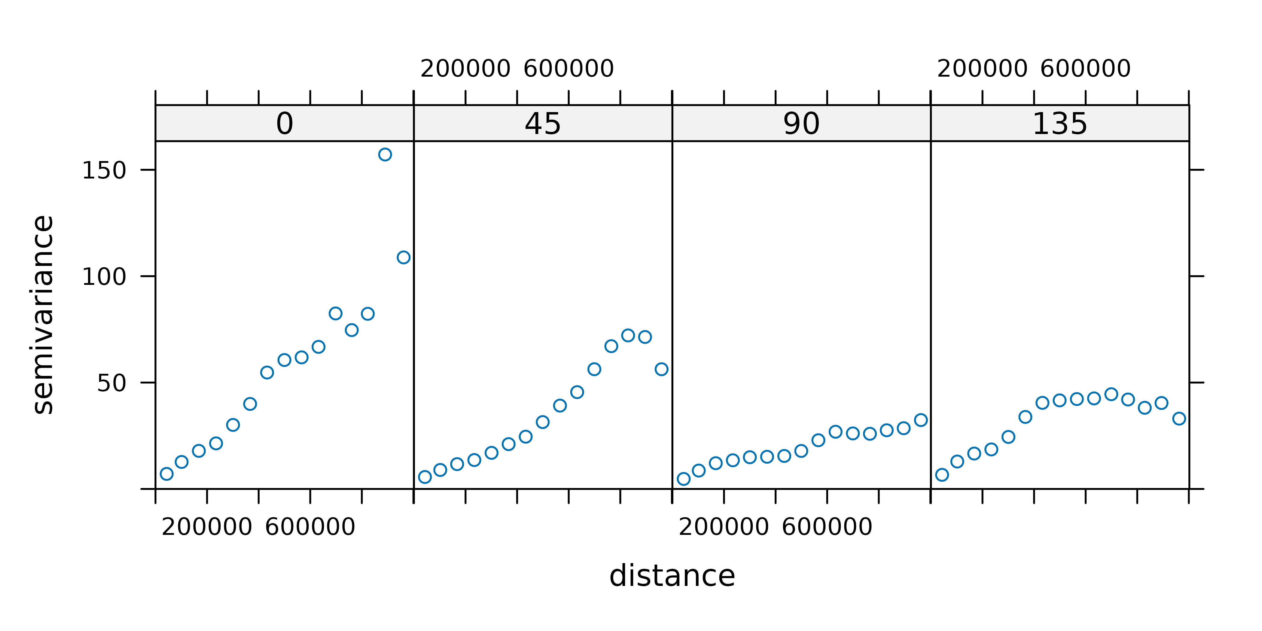
We can see that all the semivariograms exhibit spatial dependence. We choose the 90° semivariogram.
vgm_dir_selected <- variogram(
tmin ~ 1,
clim_data_clean_nodup,
cutoff = 1000000,
alpha = 90
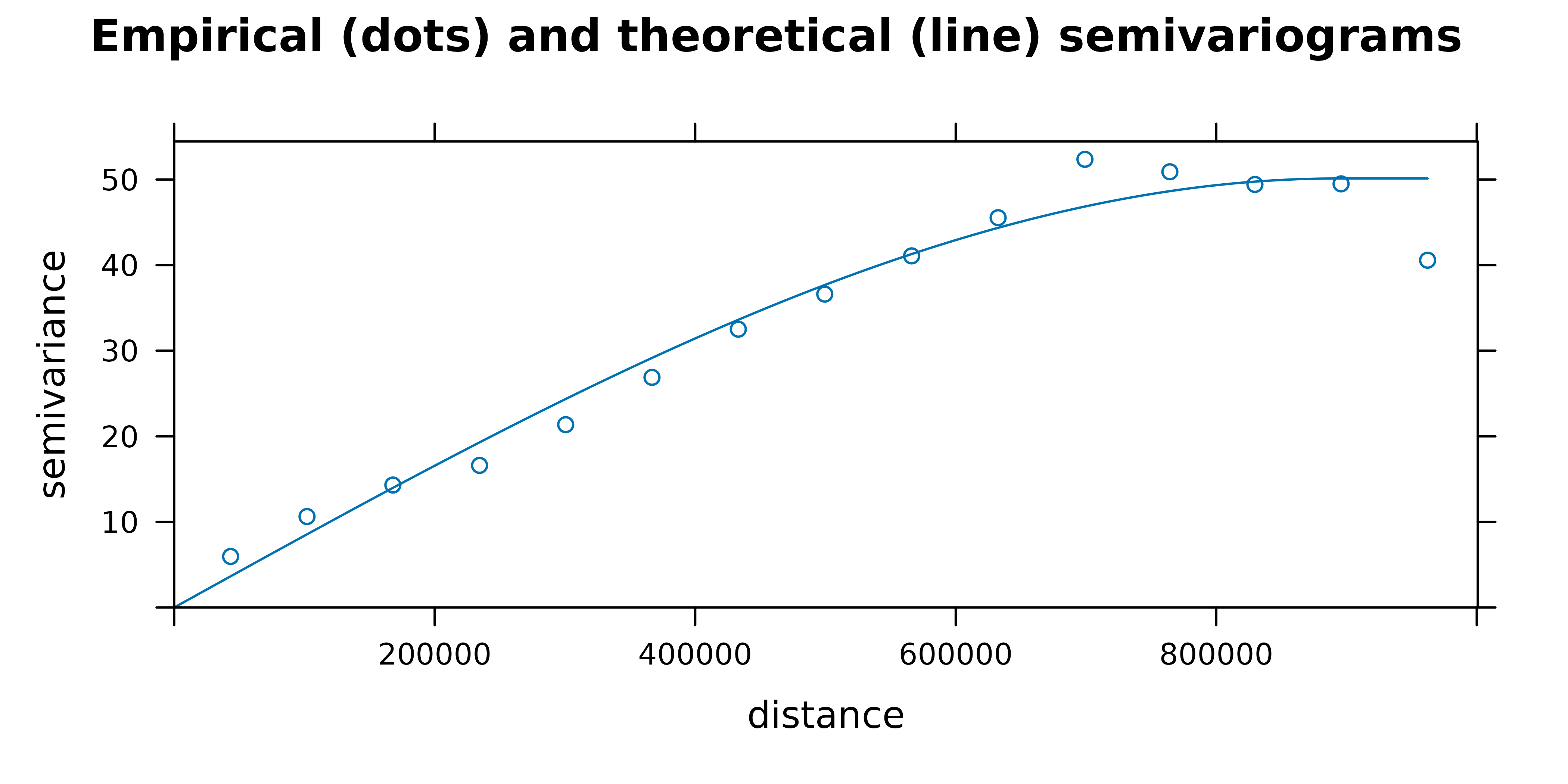
)Now, we fit the empirical semivariogram to a theoretical semivariogram, which is included in the kriging equations. In our case, the object fit_var contains the value of the estimated parameters.
fit_var <- fit.variogram(vgm_dir_selected, model = vgm(model = "Sph"))

fit_var
#>   model    psill    range
#> 1   Sph 50.01735 889199.9
Finally, we plot the empirical and the theoretical semivariograms together.
plot(
  vgm_dir_selected,
  fit_var,
  main = "Empirical (dots) and theoretical (line) semivariograms "
)
Carrying out ordinary kriging
Once a theoretical semivariogram has been chosen, we are ready for spatial prediction. The method geostatistics uses for spatial prediction is termed kriging in honor of the South African mining engineer, Daniel Gerhardus Krige.
According to Montero et al. (2015), kriging aims to predict the value of a random function, Z(s), at one or more unobserved points (or blocks) from a collection of data observed at n points (or blocks in the case of block prediction) of a domain D, and provides the best linear unbiased predictor (BLUP) of the regionalized variable under study at such unobserved points or blocks
There are different kinds of kriging depending on the characteristics of the spatial process: simple, ordinary or universal kriging (external drift kriging), kriging in a local neighborhood, point kriging or kriging of block mean values and conditional (Gaussian or indicator) simulation equivalents for all kriging varieties.
In this work, we deal with ordinary kriging, the most widely used kriging method. According to Wackernagel (1995) it serves to estimate a value at a point of a region for which a variogram is known, using data in the neighborhood of the estimation location.
In this study, we perform ordinary kriging (OK) following Hijmans and Ghosh (2023).
# Pass the input as a data frame.
clim_data_clean_nodup_df <- vect(clim_data_clean_nodup) |>
  as_tibble(geom = "XY")

clim_data_clean_nodup_df
#> # A tibble: 738 × 4
#>    fecha       tmin       x        y
#>    <date>     <dbl>   <dbl>    <dbl>
#>  1 2021-01-08   4.2 672171. 4229216.
#>  2 2021-01-08   0.4 974470. 4626714.
#>  3 2021-01-08   5.9 342908. 4117910.
#>  4 2021-01-08  -7.6 246984. 4576961.
#>  5 2021-01-08   0.1 740805. 4456820.
#>  6 2021-01-08  -9.7 433671. 4553921.
#>  7 2021-01-08   1.3 691017. 4333929.
#>  8 2021-01-08   0.6 179244. 4231942.
#>  9 2021-01-08  -4.9 227110. 4495959.
#> 10 2021-01-08   3.8 714492. 4319880.
#> # ℹ 728 more rows

k <- gstat(
  formula = tmin ~ 1,
  locations = ~ x + y,
  data = clim_data_clean_nodup_df,
  model = fit_var
)

kriged <- interpolate(grd, k, debug.level = 0)
Now, we plot the kriging prediction:
pred <- ggplot(esp_sf_utm) +
  geom_spatraster(data = kriged, aes(fill = var1.pred)) +
  geom_sf(colour = "black", fill = NA) +
  scale_fill_gradientn(
    colours = pal_paper,
    breaks = br_paper,
    labels = scales::label_number(suffix = "°"),
    guide = guide_legend(
      reverse = TRUE,
      title = "Min. temp\n(kriged)"
    )
  ) +
  theme_light() +
  labs(
    title = "Ordinary kriging - minimum temperature",
    subtitle = format(as.Date(date_select), "%d %b %Y")
  ) +
  theme(
    plot.title = element_text(size = 12, face = "bold"),
    plot.subtitle = element_text(size = 8, face = "italic"),
    panel.grid = element_blank(),
    panel.border = element_blank()
  )

pred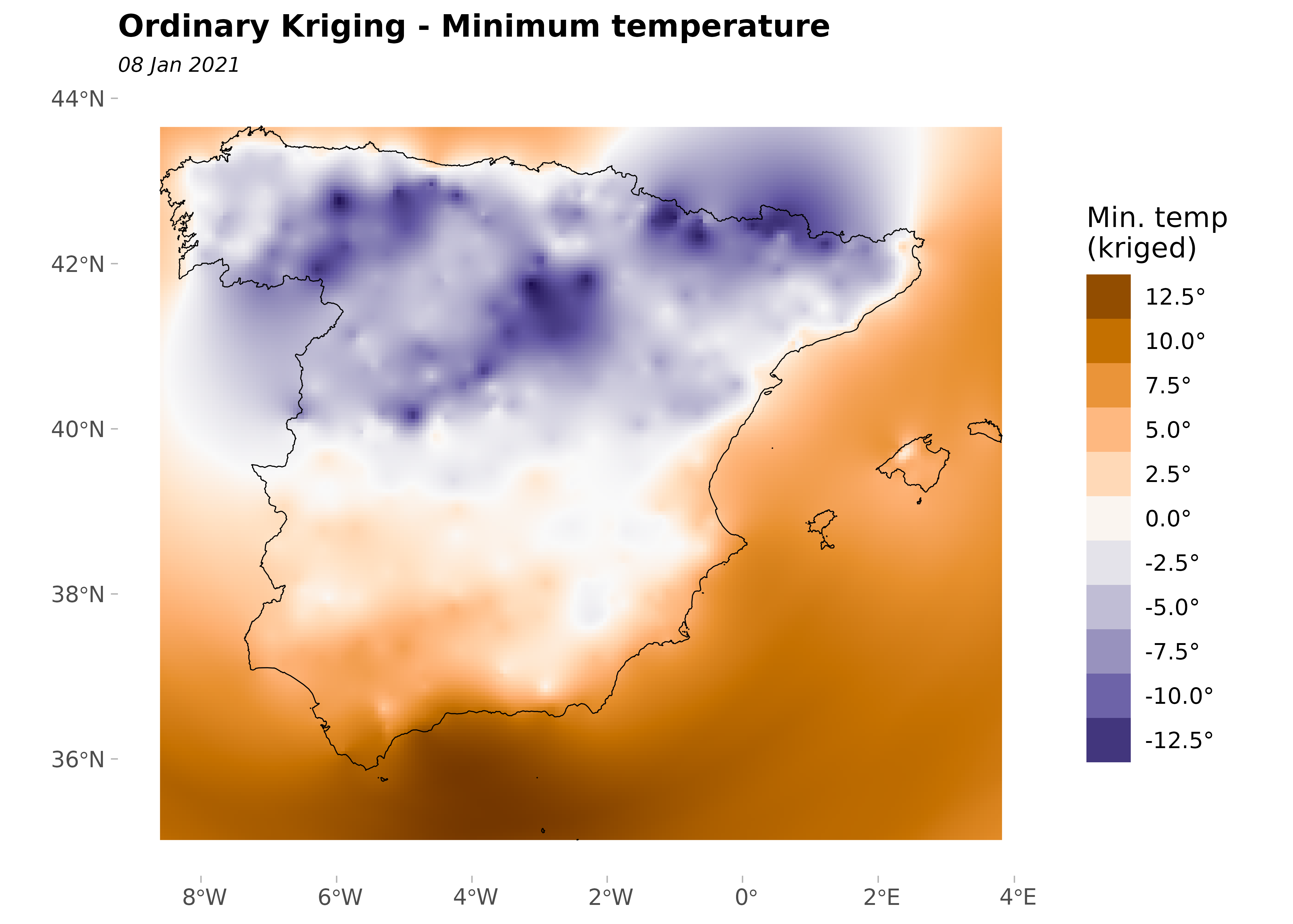
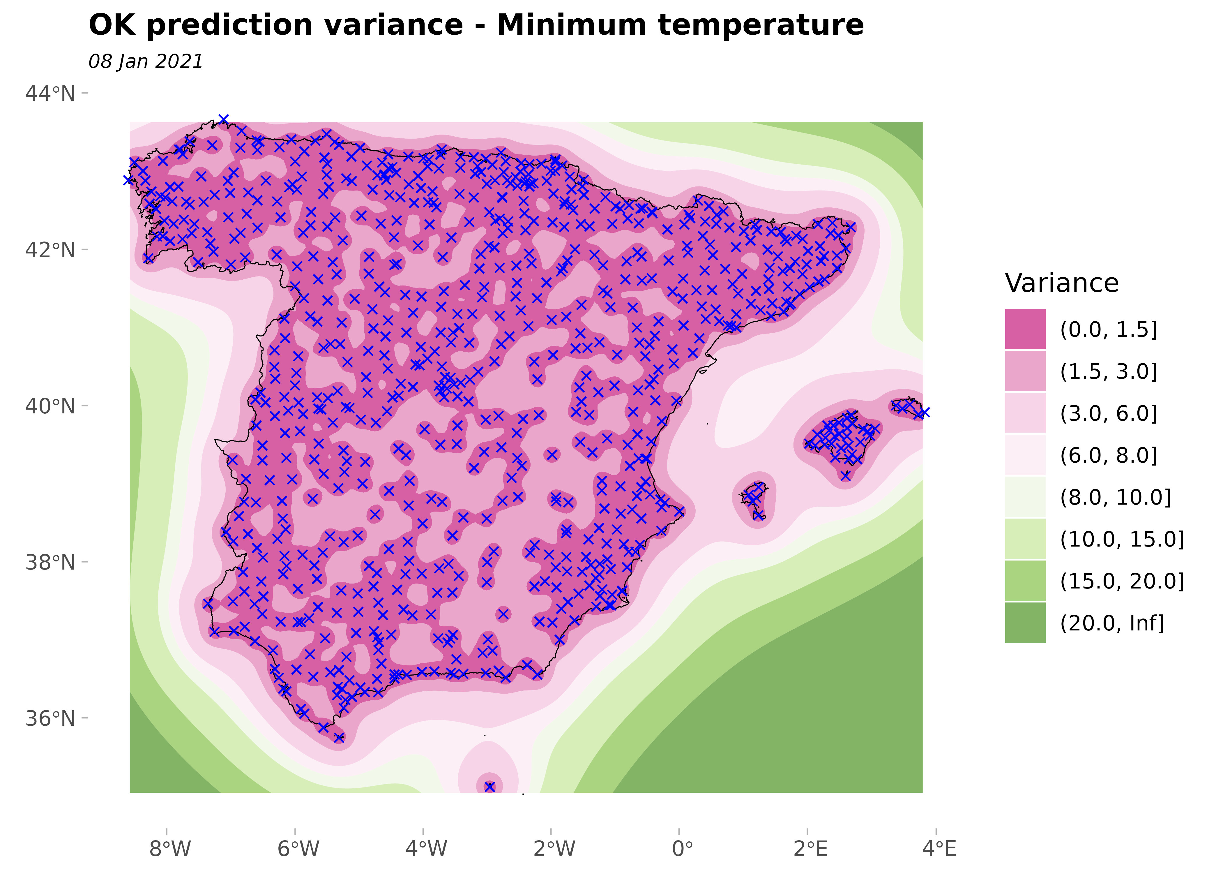
And the variance of the prediction:
ggplot(esp_sf_utm) +
  geom_spatraster_contour_filled(
    data = kriged,
    aes(z = var1.var),
    breaks = c(0, 1.5, 3, 6, 8, 10, 15, 20, Inf)
  ) +
  geom_sf(colour = "black", fill = NA) +
  geom_sf(data = clim_data_clean_nodup, colour = "blue", shape = 4) +
  scale_fill_whitebox_d(
    palette = "pi_y_g",
    alpha = 0.7,
    guide = guide_legend(title = "Variance")
  ) +
  theme_light() +
  labs(
    title = "OK prediction variance - Minimum temperature",
    subtitle = format(as.Date(date_select), "%d %b %Y")
  ) +
  theme(
    plot.title = element_text(size = 12, face = "bold"),
    plot.subtitle = element_text(size = 8, face = "italic"),
    panel.grid = element_blank(),
    panel.border = element_blank()
  )
Finally, we plot the variance and the prediction together:
pred +
  geom_sf(data = clim_data_clean_nodup, colour = "darkred", shape = 20) +
  geom_spatraster_contour(
    data = kriged,
    aes(z = var1.var),
    breaks = c(0, 2.5, 5, 10, 15, 20)
  ) +
  labs(
    title = "OK: Prediction and variance prediction",
    caption = "Points: Climate stations.\nLines: Cluster of variances"
  )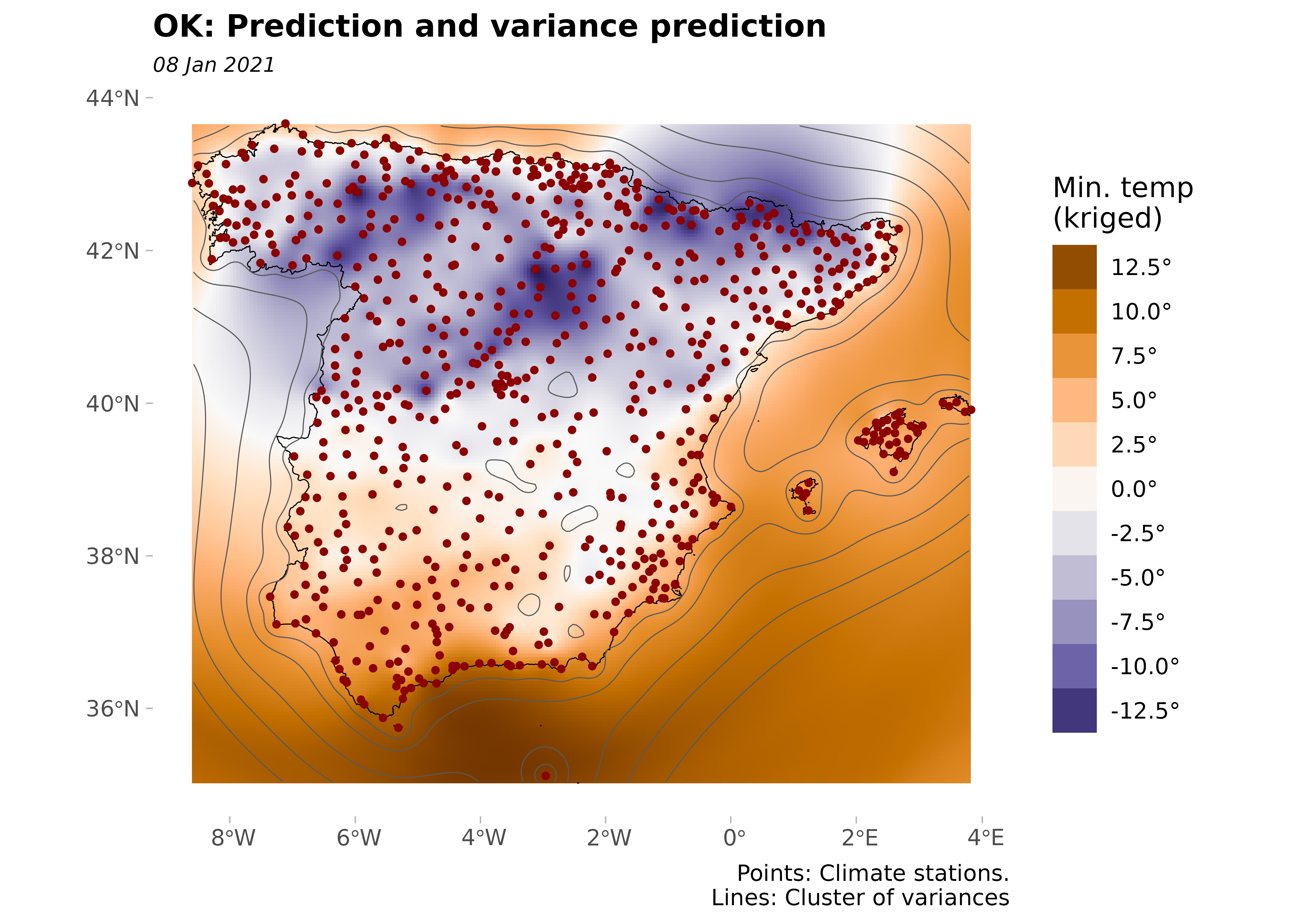
The prediction variance is minimal in areas near the observed points. In contrast, prediction variance is higher in areas where no monitoring stations are available.
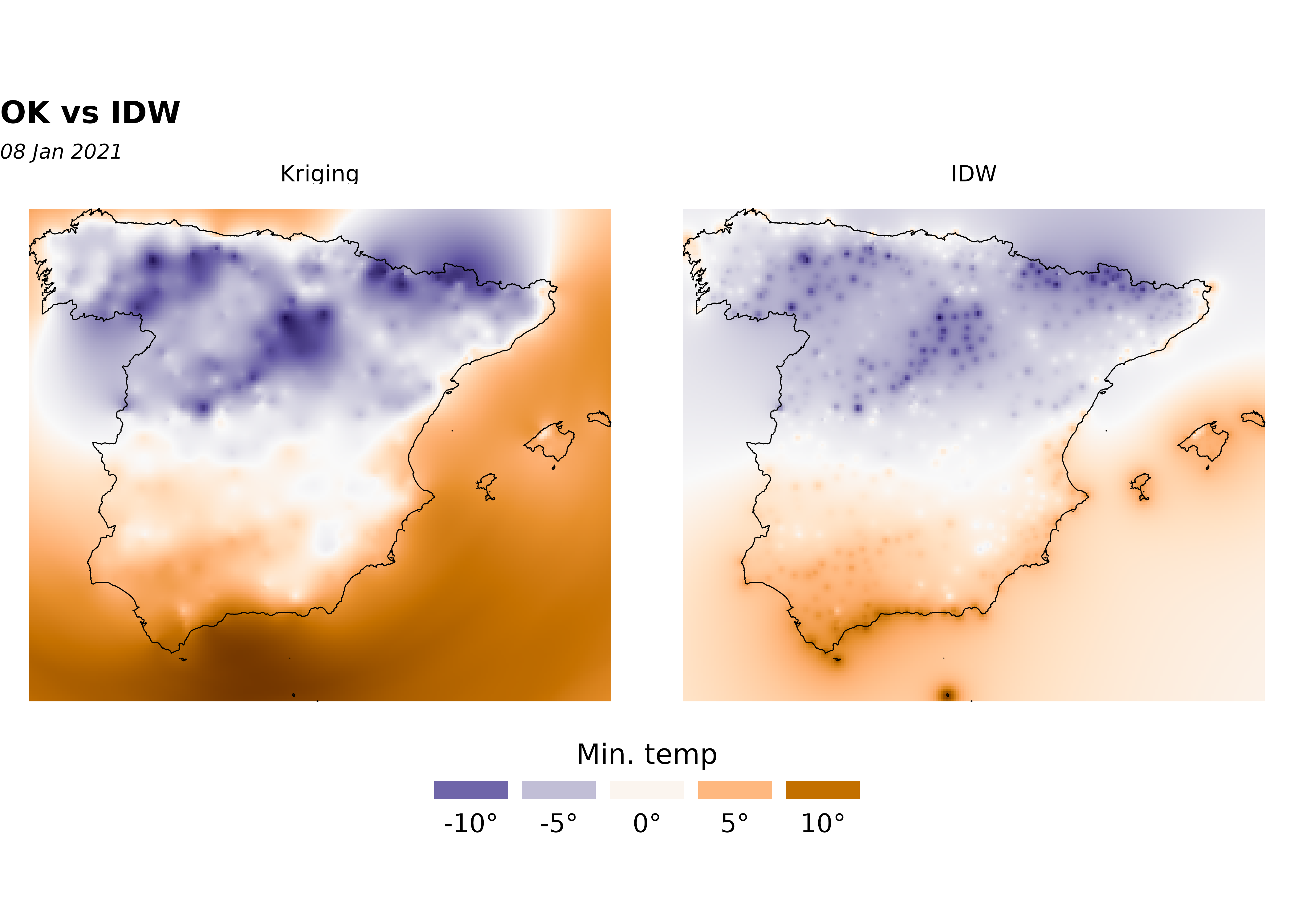
Comparing ordinary kriging with inverse distance weighting
In this section, we compare ordinary kriging (OK) with inverse distance weighting (IDW), one of several approaches for spatial interpolation. Once again, we apply the approach described in Hijmans and Ghosh (2023) on how to perform this analysis in R with terra.
IDW is a deterministic interpolation technique that creates surfaces from sample points using an inverse distance function of neighboring points. On the other hand, stochastic interpolation techniques like kriging use the statistical properties of the sample points (based on the variogram, which gives the spatial structure of the studied variable). Moreover, kriging provides an error prediction map.
gs <- gstat(
  formula = tmin ~ 1,
  locations = ~ x + y,
  data = clim_data_clean_nodup_df,
  set = list(idp = 2.0)
)

idw <- interpolate(grd, gs)
#> [inverse distance weighted interpolation]
#> [inverse distance weighted interpolation]

# Create a SpatRaster with two layers, one prediction each.

all_methods <- c(
  kriged |> select(Kriging = var1.pred),
  idw |> select(IDW = var1.pred)
)

# Plot and compare.
ggplot(esp_sf_utm) +
  geom_spatraster(data = all_methods) +
  facet_wrap(~lyr) +
  geom_sf(colour = "black", fill = NA) +
  scale_fill_gradientn(
    colours = pal_paper,
    n.breaks = 10,
    labels = scales::label_number(suffix = "°"),
    guide = guide_legend(
      title = "Min. temp",
      direction = "horizontal",
      keyheight = 0.5,
      keywidth = 2,
      title.position = "top",
      title.hjust = 0.5,
      label.hjust = 0.5,
      nrow = 1,
      byrow = TRUE,
      reverse = FALSE,
      label.position = "bottom"
    )
  ) +
  theme_void() +
  labs(
    title = "OK vs IDW",
    subtitle = format(as.Date(date_select), "%d %b %Y")
  ) +
  theme(
    panel.grid = element_blank(),
    panel.border = element_blank(),
    plot.title = element_text(size = 12, face = "bold"),
    plot.subtitle = element_text(size = 8, face = "italic"),
    legend.text = element_text(size = 10),
    legend.title = element_text(size = 11),
    legend.position = "bottom"
  )
Cross-validation
To compare the two interpolation methods, OK and IDW, we need to carry out a cross-validation (CV) or leave-one-out process. Moreover, CV is the most widely-used procedure to validate the semivariogram model selected in a kriging interpolation.
## Cross-validation: OK
xv_ok <- krige.cv(tmin ~ 1, clim_data_clean_nodup, fit_var)

xv_ok |>
  st_drop_geometry() |>
  summarise(across(
    everything(),
    list(min = min, max = max),
    .names = "{.col}_{.fn}"
  )) |>
  pivot_longer(everything(), names_to = c("field", "stat"), names_sep = "_") |>
  pivot_wider(id_cols = stat, names_from = field)
#> # A tibble: 2 × 7
#>   stat  var1.pred var1.var observed residual zscore  fold
#>   <chr>     <dbl>    <dbl>    <dbl>    <dbl>  <dbl> <dbl>
#> 1 min       -12.9  0.00379    -15.1    -8.24  -8.55     1
#> 2 max        14.0 17.6         13.6     6.69   8.65   738
# Cross-validation: IDW
xv_idw <- krige.cv(tmin ~ 1, clim_data_clean_nodup)

xv_idw |>
  st_drop_geometry() |>
  summarise(across(
    everything(),
    list(min = min, max = max),
    .names = "{.col}_{.fn}"
  )) |>
  pivot_longer(everything(), names_to = c("field", "stat"), names_sep = "_") |>
  pivot_wider(id_cols = stat, names_from = field)
#> # A tibble: 2 × 7
#>   stat  var1.pred var1.var observed residual zscore  fold
#>   <chr>     <dbl>    <dbl>    <dbl>    <dbl>  <dbl> <dbl>
#> 1 min      -11.5        NA    -15.1    -9.49     NA     1
#> 2 max        9.59       NA     13.6    10.8      NA   738
Now, we plot the leave-one-out cross-validation residuals and observe that the residuals with OK are smaller than with IDW.
# Create a unique scale.

allvalues <- values(all_methods, na.rm = TRUE, mat = FALSE)

# Prepare final data
cross_val <- xv_ok |>
  mutate(method = "OK") |>
  bind_rows(
    xv_idw |>
      mutate(method = "IDW")
  ) |>
  select(method, residual) |>
  mutate(method = as_factor(method), cat = cut_number(residual, 5))

ggplot(cross_val) +
  geom_sf(data = esp_sf_utm, fill = "grey90") +
  geom_sf(aes(fill = cat, size = cat), shape = 21) +
  facet_wrap(~method) +
  scale_size_manual(values = c(1.5, 1, 0.5, 1, 1.5)) +
  scale_fill_whitebox_d(palette = "pi_y_g", alpha = 0.7) +
  labs(
    title = "Tmin: leave-one-out cross validation residuals",
    subtitle = "By method",
    fill = "",
    size = ""
  ) +
  theme(
    plot.title = element_text(size = 12, face = "bold"),
    plot.subtitle = element_text(size = 8, face = "italic"),
    strip.text = element_text(face = "bold")
  )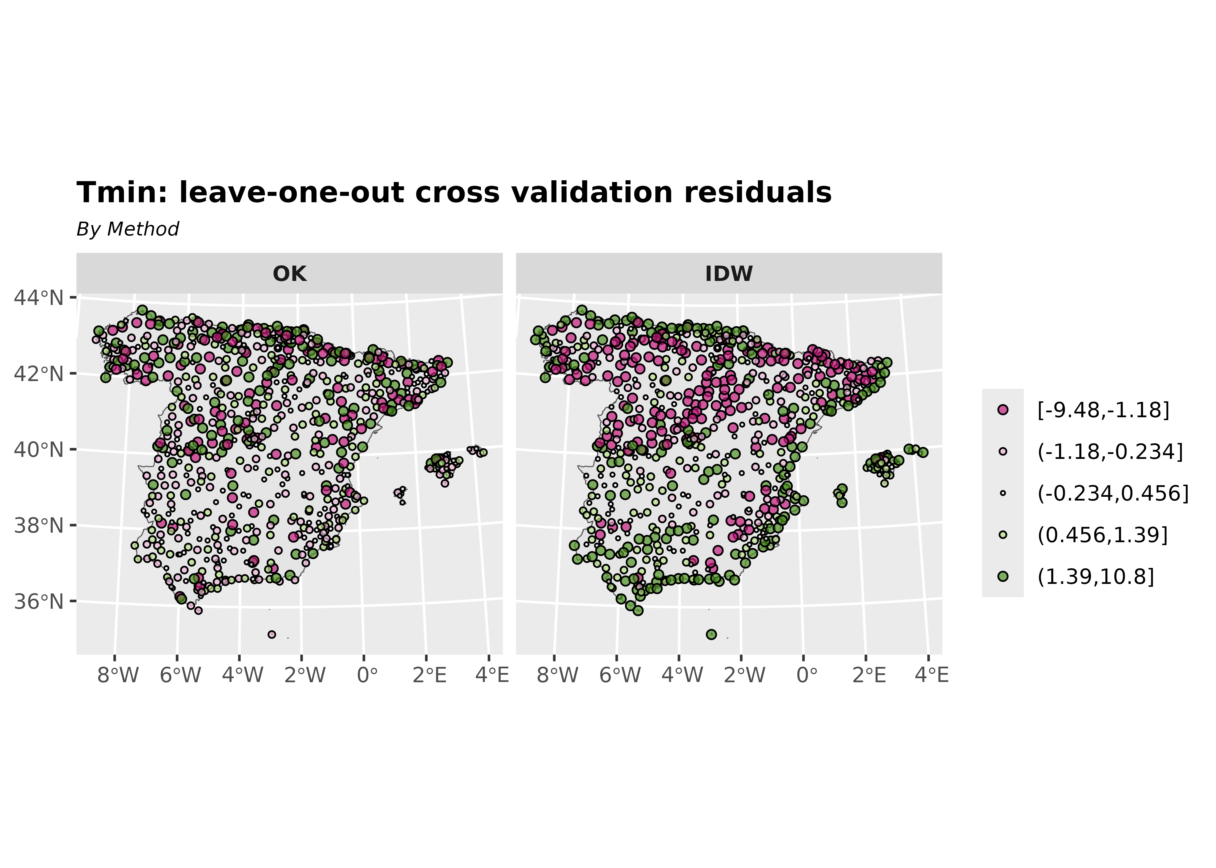
Moreover, calculating diagnostic statistics from the results is a good way to select the best interpolation method. The error-based measures used in the study include the root-mean-square error (RMSE) and the mean error (ME).
# OK Diagnostic statistics

me_ok <- me(xv_ok$observed, xv_ok$var1.pred)

rmse_ok <- rmse(xv_ok$observed, xv_ok$var1.pred)

# IDW Diagnostic statistics

me_idw <- me(xv_idw$observed, xv_idw$var1.pred)

rmse_idw <- rmse(xv_idw$observed, xv_idw$var1.pred)
As expected, OK yields better predictions than IDW.
| Diagnostic statistics | ME | RMSE |
|---|---|---|
| OK | -0.028 | 1.659 |
| IDW | -0.037 | 2.253 |
References
Cressie, Noel A. C. 1993. “Statistics for Spatial Data.” Chap. 1 in Statistics for Spatial Data, Rev. ed. Wiley Series in Probability and Statistics. John Wiley & Sons, Ltd. https://doi.org/10.1002/9781119115151.ch1.
Gräler, Benedikt, Edzer Pebesma, and Gerard Heuvelink. 2016. “Spatio-Temporal Interpolation Using Gstat.” The R Journal 8: 204–18. https://journal.r-project.org/archive/2016/RJ-2016-014/index.html.
Hijmans, Robert J., and Aniruddha Ghosh. 2023. “Interpolation.” Chap. 4 in Spatial Data Analysis with R. Spatial Data Science with R and "terra". Online. https://rspatial.org/analysis/analysis.pdf.
Montero, José-Marı́a, Gema Fernández-Avilés, and Jorge Mateu. 2015. Spatial and Spatio-Temporal Geostatistical Modeling and Kriging. Wiley Series in Probability and Statistics. Wiley. https://doi.org/10.1002/9781118762387.
Pebesma, Edzer J. 2004. “Multivariable Geostatistics in S: The gstat Package.” Computers & Geosciences 30: 683–91. https://doi.org/10.1016/j.cageo.2004.03.012.
Pizarro, Manuel, Diego Hernangómez, and Gema Fernández-Avilés. 2021. climaemet: Climate AEMET Tools. Zenodo. https://doi.org/10.5281/ZENODO.5512237.
Ribeiro Jr, Paulo Justiniano, and Peter Diggle. 2001. geoR: Analysis of Geostatistical Data. The R Foundation. https://doi.org/10.32614/cran.package.geor.
Tobler, Waldo R. 1969. “Geographical Filters and Their Inverses.” Geographical Analysis 1 (3): 234–53. https://doi.org/10.1111/j.1538-4632.1969.tb00621.x.
Wackernagel, Hans. 1995. “Ordinary Kriging.” Chap. 11 in Multivariate Geostatistics: An Introduction with Applications. Springer Berlin Heidelberg. https://doi.org/10.1007/978-3-662-03098-1_11.