Skip to contents

This article presents selected Spanish macroeconomic indicators retrieved with tidyBdE from Banco de España bulk CSV files.

Last updated: 05-October-2026.

library(tidyBdE)
library(ggplot2)
library(dplyr)
library(tidyr)

# Set plot parameters and the date range.
col <- bde_tidy_palettes(1, "bde_rose_pal")
date <- Sys.Date()
ny <- as.numeric(format(date, format = "%Y")) - 6
nd <- as.Date(paste0(ny, "-12-31"))

br <- seq(nd, Sys.Date(), "6 months")

GDP of Spain

Aggregated over the last four quarters
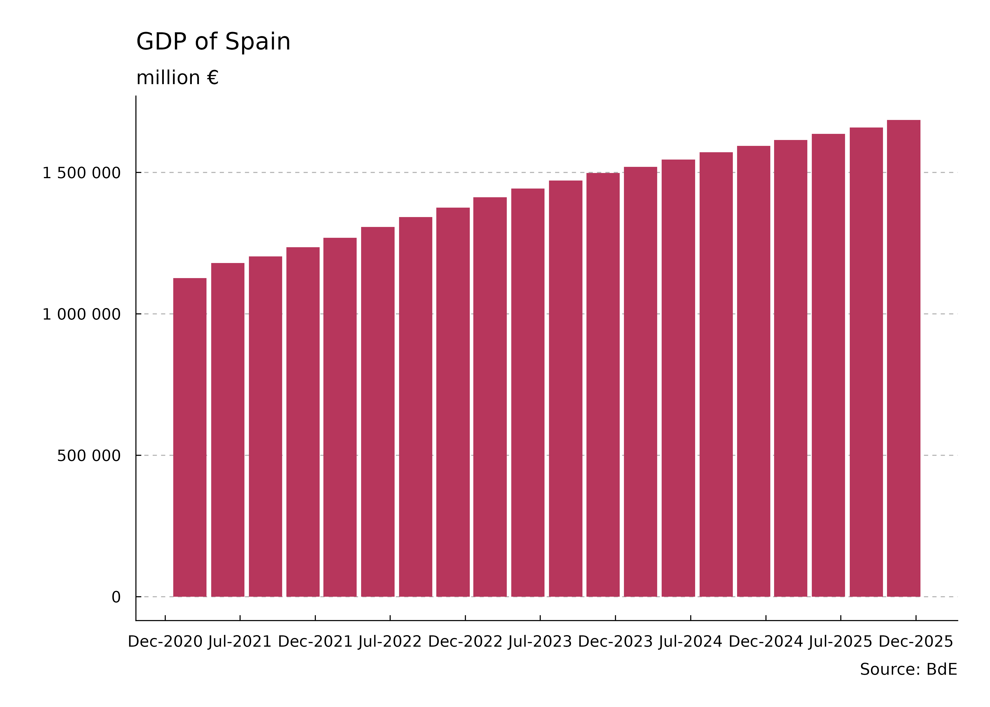
Bar chart with dates on the horizontal axis and GDP in millions of euros on the vertical axis. Each quarterly bar sums GDP over that quarter and the preceding three quarters, showing the rolling annual total for Spain.
Figure 1: GDP of Spain — aggregated over the last four quarters

Year-on-year variation
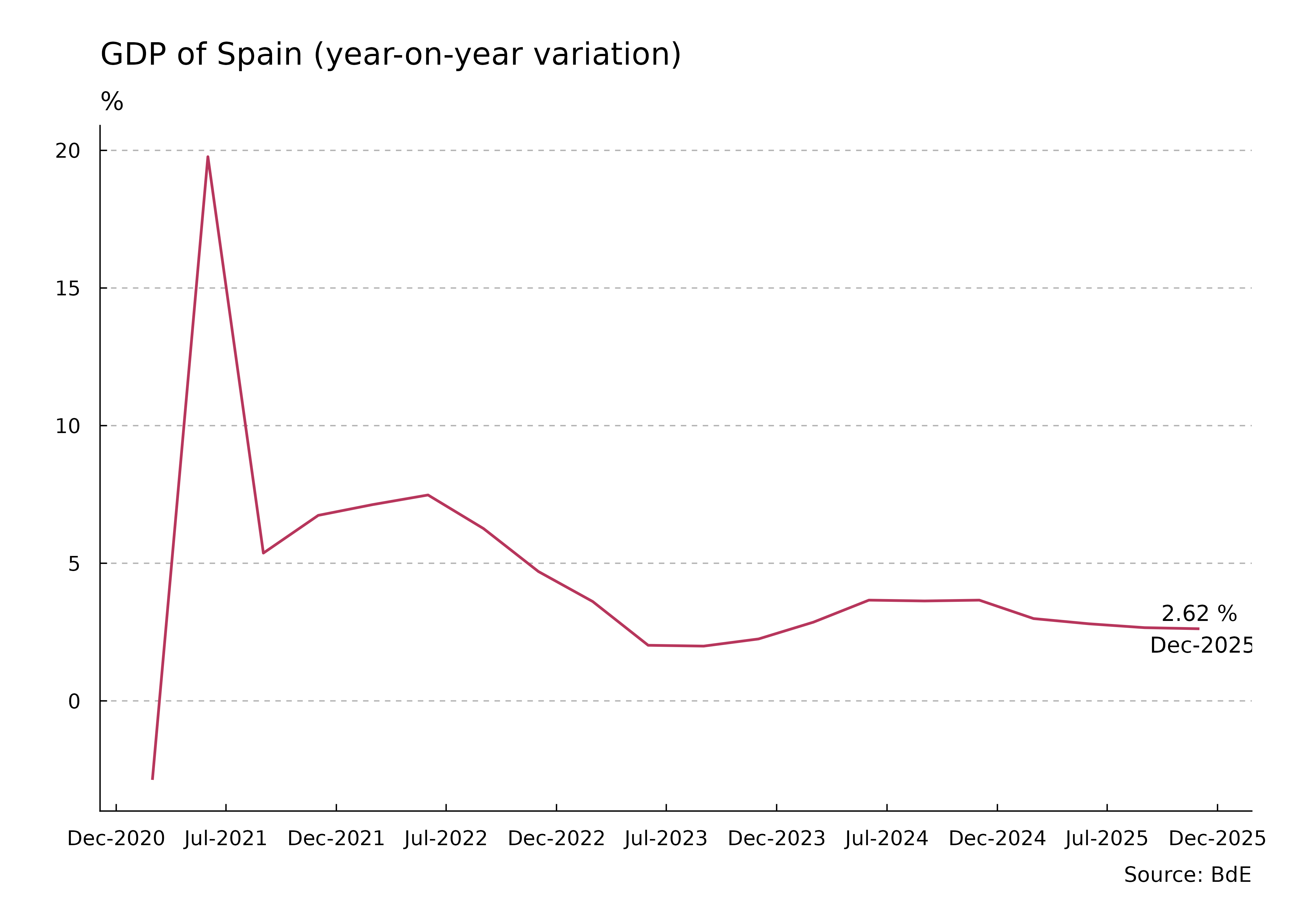
Line chart with dates on the horizontal axis and year-on-year GDP change in percent on the vertical axis. Positive values indicate growth and negative values indicate contraction in Spain. The latest observation is labeled with its value and date.
Figure 2: GDP of Spain — year-on-year variation

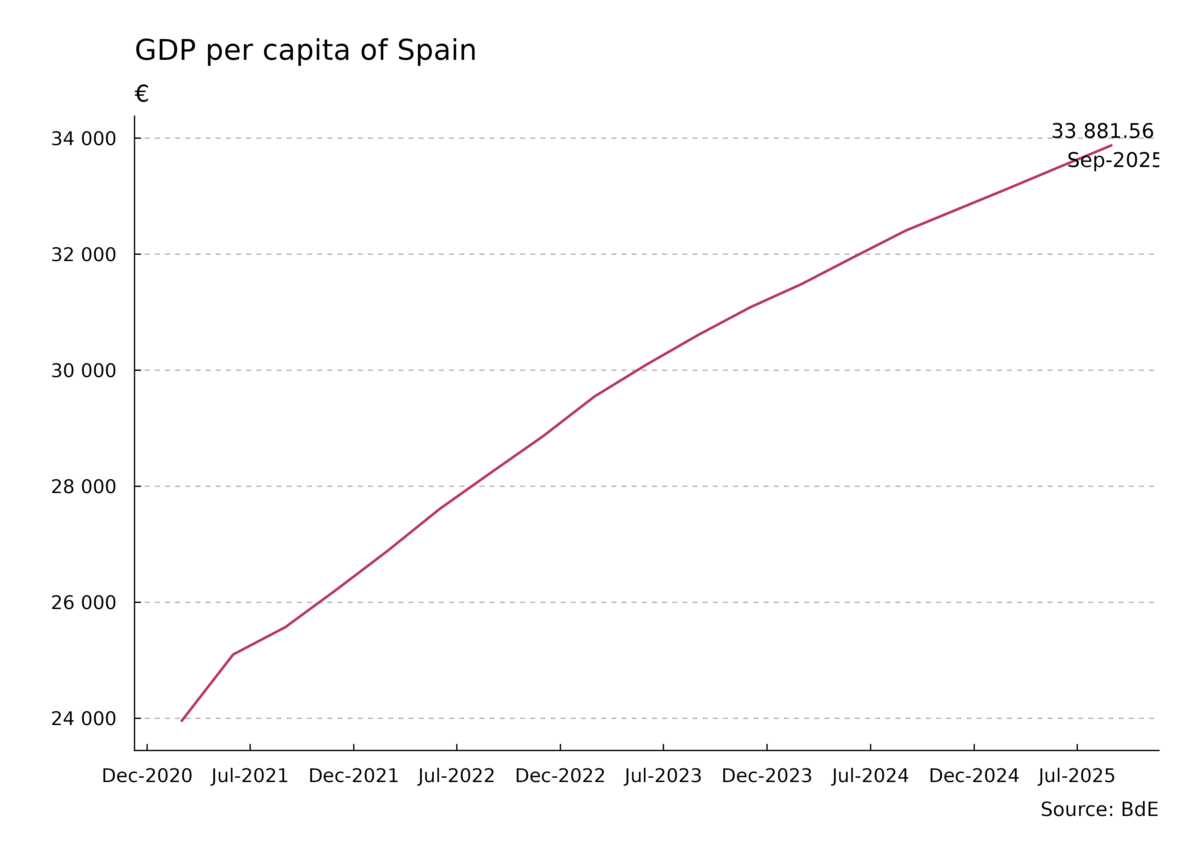
GDP per capita

Line chart with dates on the horizontal axis and GDP per person in euros on the vertical axis. Values divide GDP summed over the last four quarters by the population of Spain. The latest observation is labeled with its value and date.
Figure 3: GDP per capita of Spain

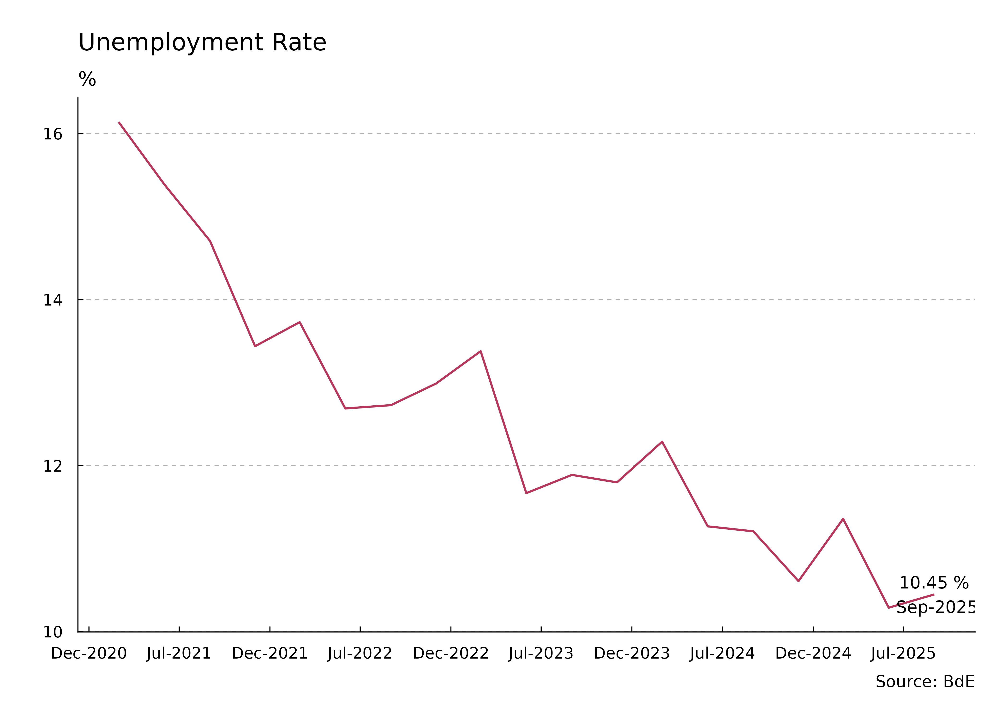
Unemployment rate

Line chart with dates on the horizontal axis and the unemployment rate in percent on the vertical axis. The series tracks unemployment in Spain over the selected period. The latest observation is labeled with its rate and date.
Figure 4: Unemployment rate

Consumer price index
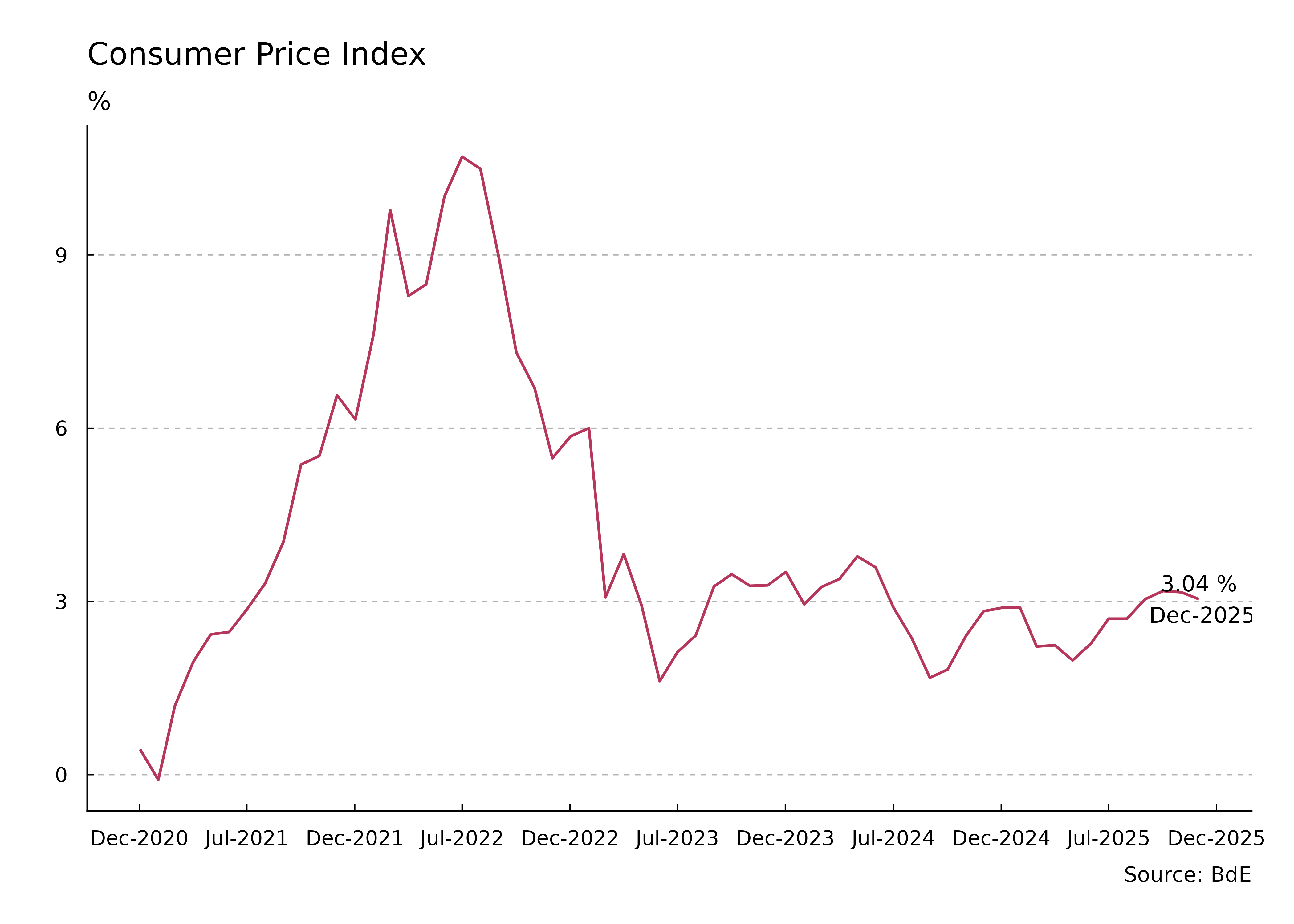
Line chart with dates on the horizontal axis and year-on-year consumer price change in percent on the vertical axis. Positive values indicate inflation and negative values indicate falling consumer prices in Spain. The latest observation is labeled with its rate and date.
Figure 5: Consumer price index

Monthly Euribor
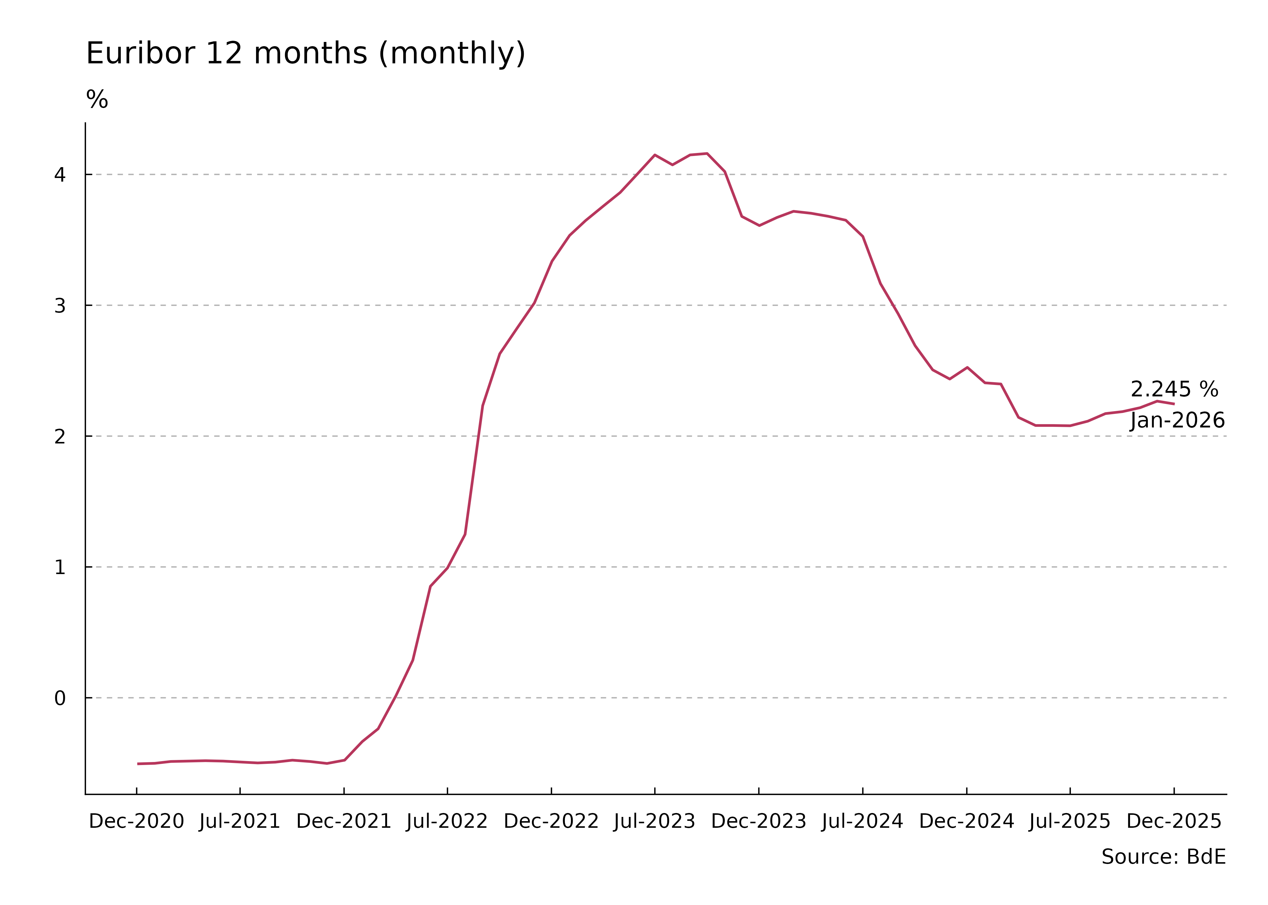
Line chart with dates on the horizontal axis and the monthly 12-month Euribor rate in percent on the vertical axis. The series tracks changes in this interest rate over the selected period. The latest observation is labeled with its rate and date.
Figure 6: 12-month Euribor (monthly)

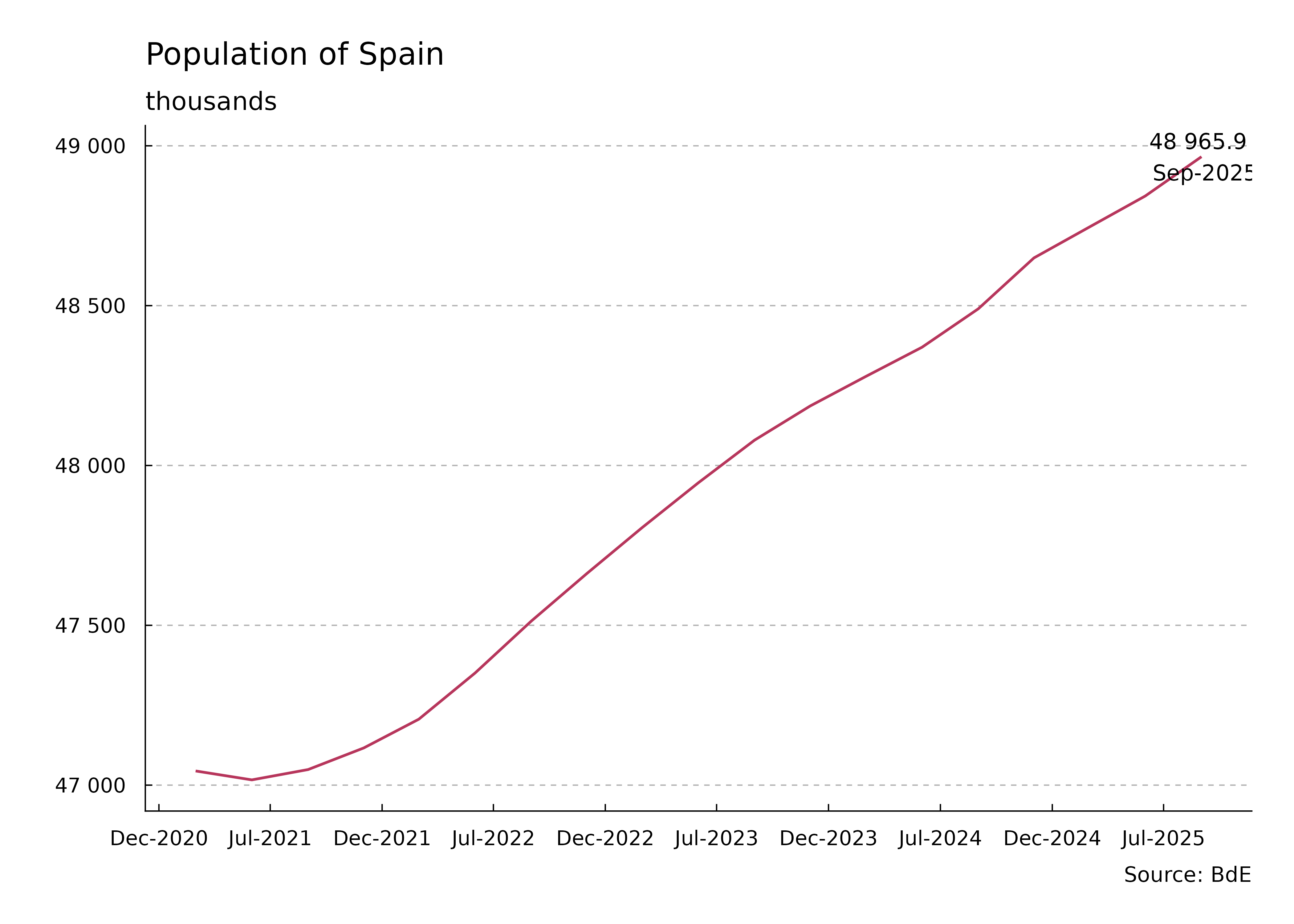
Population

Line chart with dates on the horizontal axis and the population of Spain in thousands on the vertical axis. The series tracks population over the selected period. The latest observation is labeled with its population value and date.
Figure 7: Population (thousands)