Use case: migration flows
example-usage.RmdIn this use case we show how to use tidycenso
to visualize the most important internal migration flows over the last
10 years.
First download the number of people by province of residence in 2011 and 2020.
library(tidycenso)
library(dplyr)
#>
#> Attaching package: 'dplyr'
#> The following objects are masked from 'package:stats':
#>
#>     filter, lag
#> The following objects are masked from 'package:base':
#>
#>     intersect, setdiff, setequal, union

df <- get_censo("per.ppal", c("ID_RESI_2011_N2", "ID_RESI_2020_N2"), "SPERSONAS")

head(df)
#>   ID_RESI_2011_N2     ID_RESI_2020_N2 SPERSONAS
#> 1     02 Albacete         02 Albacete    324177
#> 2     02 Albacete 03 Alicante/Alacant      3849
#> 3     02 Albacete          04 Almería       366
#> 4     02 Albacete      01 Araba/Álava        72
#> 5     02 Albacete         33 Asturias       162
#> 6     02 Albacete            05 Ávila        39
We then do some data wrangling estimate the net flows, and select the largest ones.
df <-
  df %>%
  filter(
    ID_RESI_2011_N2 != "No consta",
    ID_RESI_2020_N2 != "No consta",
  ) %>%
  mutate(across(c(ID_RESI_2020_N2, ID_RESI_2011_N2), ~substr(., 1, 2)))

entries <-
  df %>%
  rename(to = ID_RESI_2020_N2, from = ID_RESI_2011_N2)

exits <-
  df %>%
  rename(from = ID_RESI_2020_N2, to = ID_RESI_2011_N2) %>%
  mutate(SPERSONAS = -SPERSONAS)


net_flows <-
  rbind(entries, exits) %>%
  group_by(from, to) %>%
  summarise(SPERSONAS = sum(SPERSONAS)) %>%
  filter(
    SPERSONAS > 0,
    !from %in% c("Ex", "No"),
    !to %in% c("Ex", "No")
  ) %>%
  ungroup() %>%
  slice_max(SPERSONAS, prop = .10)
#> `summarise()` has grouped output by 'from'. You can override using the
#> `.groups` argument.
With the estimated net migration flows, we can now visualize them
We’ll use tidygraph
and ggraph
to create the graph, ggplot2 to
visualize it and mapSpain
to download the geometries of the provinces.
library(tidygraph)
#>
#> Attaching package: 'tidygraph'
#> The following object is masked from 'package:stats':
#>
#> filter
library(ggraph)
#> Loading required package: ggplot2
library(mapSpain)
library(ggplot2)
library(sf)
#> Linking to GEOS 3.10.2, GDAL 3.4.1, PROJ 8.2.1; sf_use_s2() is TRUE
sf_provs <- esp_get_prov() %>%
select(cpro, ine.prov.name)
nodes <-
sf_provs %>%
st_centroid() %>%
st_coordinates() %>%
as.data.frame() %>%
mutate(id = sf_provs$cpro)
#> Warning: st_centroid assumes attributes are constant over geometries
graph <- tbl_graph(nodes, edges = net_flows, node_key = "id", directed = T)
coord_layout <-
create_layout(
graph = graph,
layout = "manual",
x = nodes$X,
y = nodes$Y
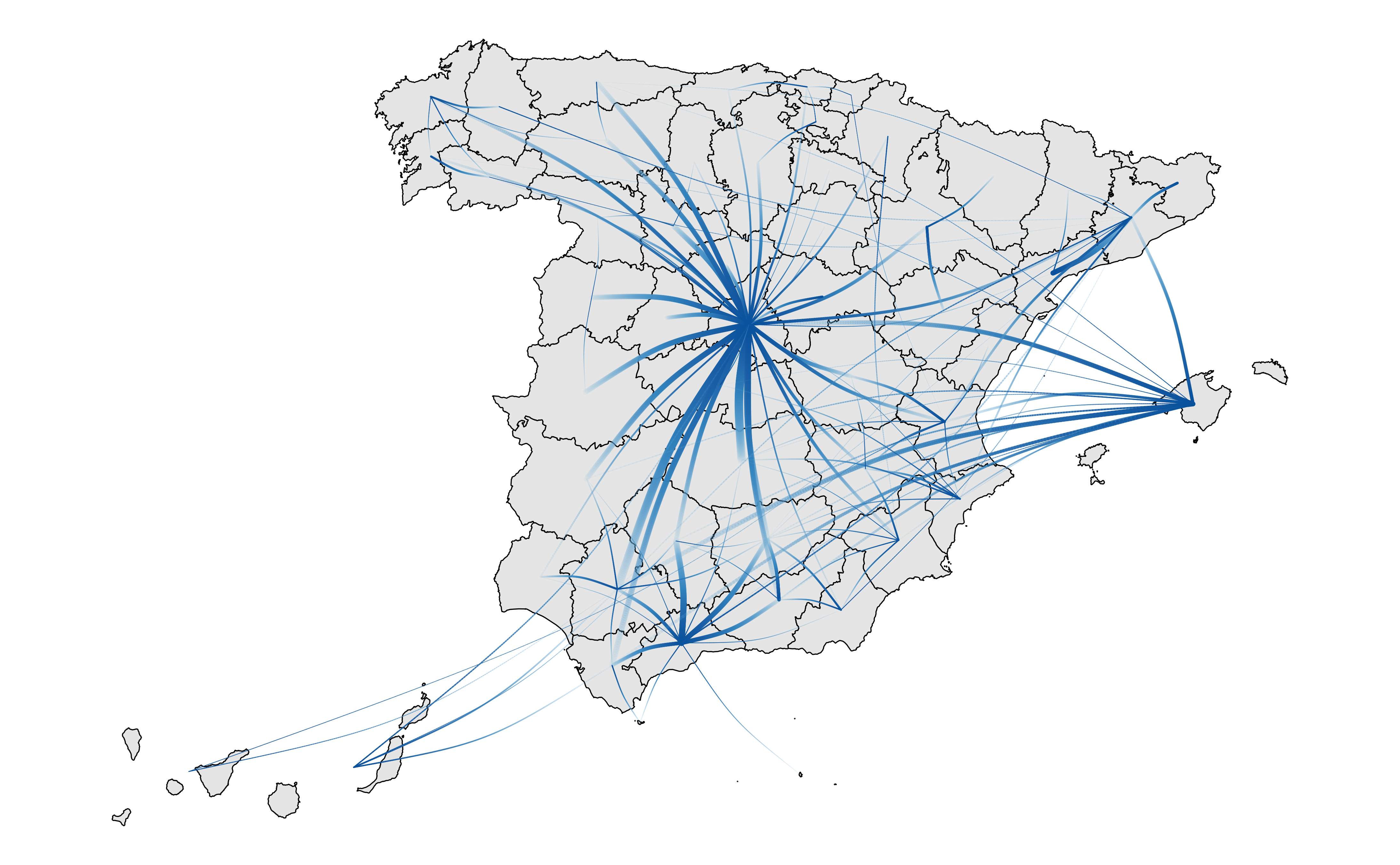
)Once we have created the graph and the layout for it, we can use ggplot2 to
visualise it.
p <-
  ggraph(coord_layout) +
  geom_sf(data = sf_provs, color = "black",  fill = "grey90") +
  geom_edge_arc(
    aes(
      width=SPERSONAS,
      alpha = after_stat(index),
      color = after_stat(index)
    ),
    lineend = "round", n = 200,
    strength = .1) +
  scale_edge_width_continuous(range=c(0.1, 1.5)) +
  scale_edge_color_gradientn(colors = scales::brewer_pal("seq", direction = 1)(5)[3:5]) +
  scale_edge_alpha(range = c(.05, 1)) +
  theme_void() +
  theme(legend.position = "none")

p
#> Warning: Using the `size` aesthetic in this geom was deprecated in ggplot2 3.4.0.
#> ℹ Please use `linewidth` in the `default_aes` field and elsewhere instead.
#> This warning is displayed once every 8 hours.
#> Call `lifecycle::last_lifecycle_warnings()` to see where this warning was
#> generated.